Project write-ups · 13 chapters
the long
versions.
What each project was, what went wrong, what I changed and what I took from it. The work list has the short version, and the résumé fits it all on one page.
- 01Digital Church Office: building for the ChurchTechnical intern
- 02SpeakEasy: built to be heardInnovating with Design and AI
- 03Cannon & Projectile ChallengeDesign Thinking Project I
- 04Physical World 1D ChallengePhysical World
- 05Life cycle analysis of a badminton racketScience for a Sustainable World
- 06Domus Orationis: a house of prayerSpatial Design World
- 07Design Computation: generative and parametricDesign Computation
- 08Reading Museum SilencesSocial Science: Behaviour, Culture and Society
- 09Social media and posters for FraternitasFraternitas, St Mary of the Angels
- 10Mission trip campaignFraternitas × CHARIS
- 11Photography: thirty-six frames at a timeSince 2020
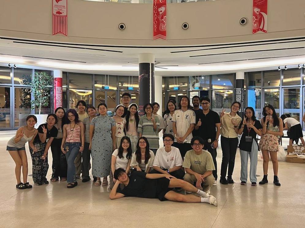
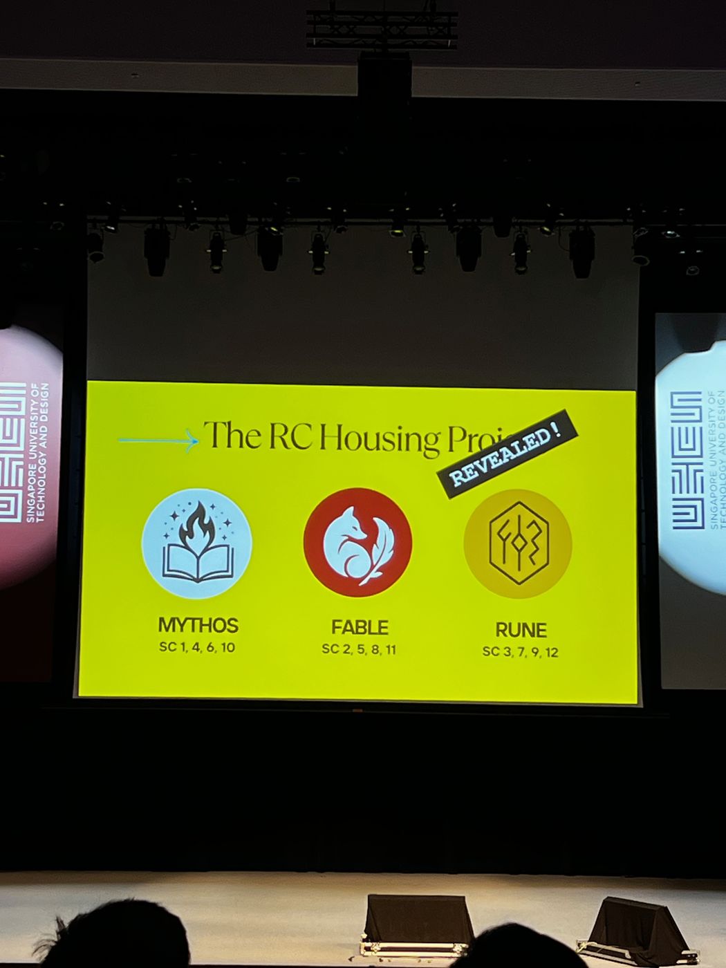
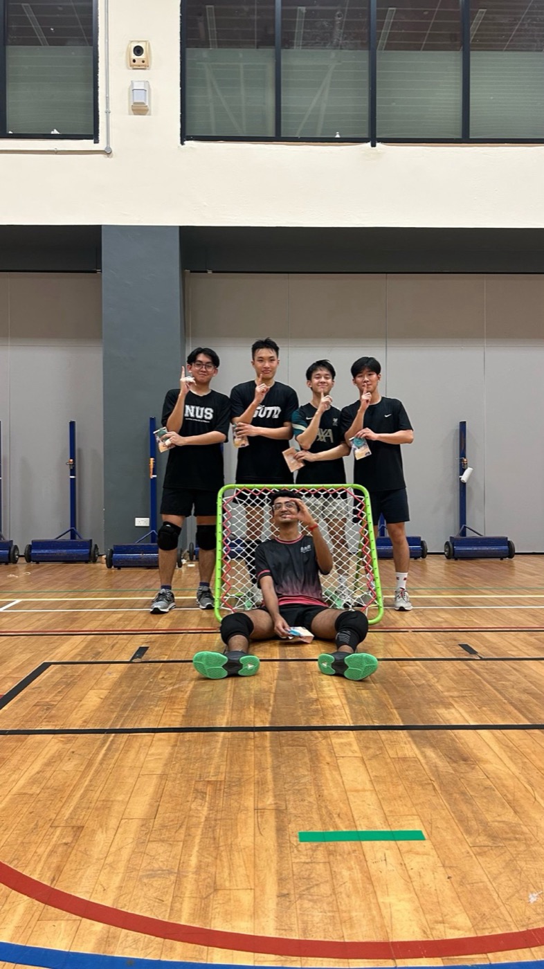
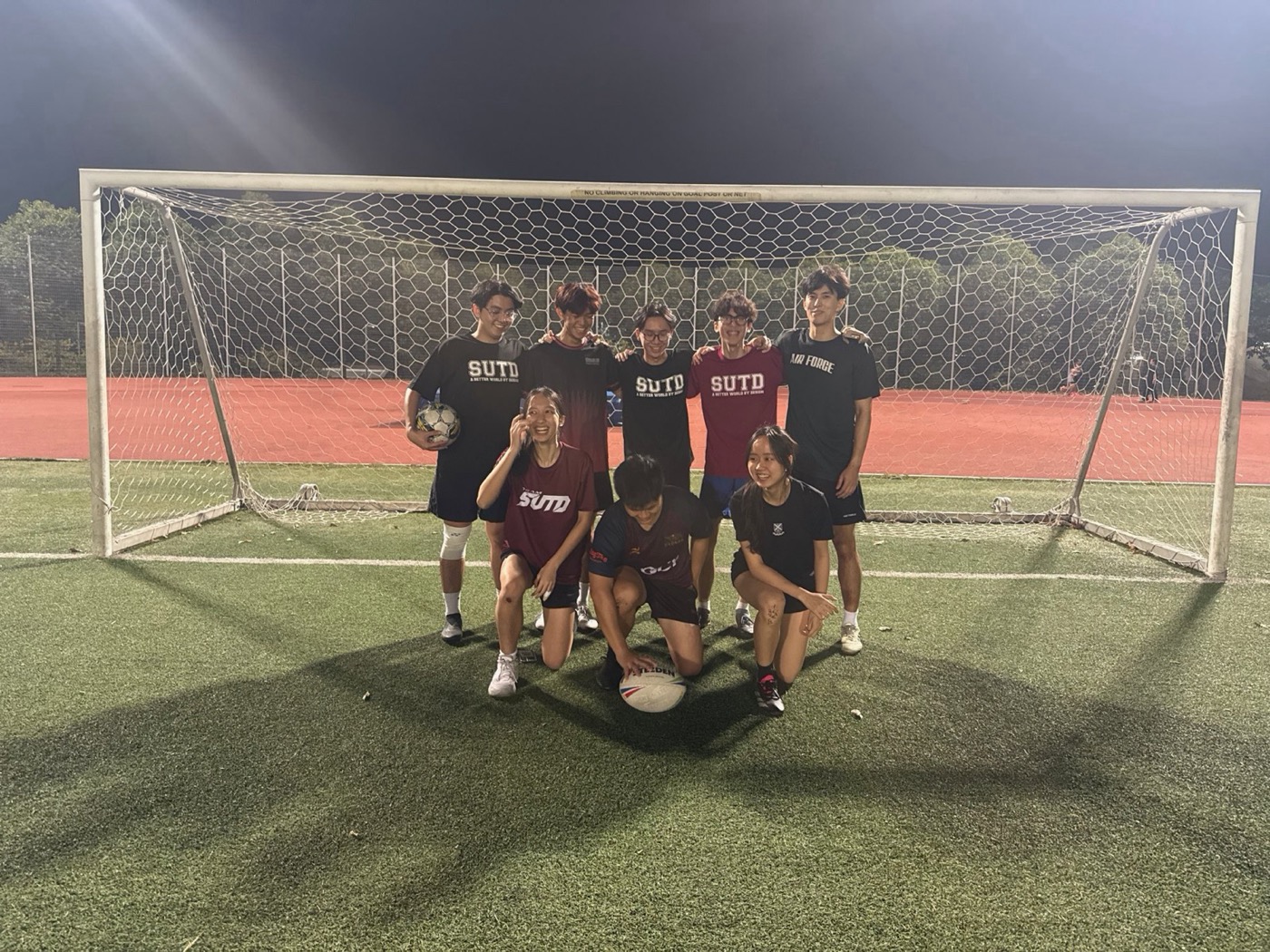
- 12Fifth Row and campus lifeMythos House Secretary
- 13My SUTD journeyFreshmore year
Digital Church Office: building for the Church
Since September 2026, I have been a technical intern at the Digital Church Office (DCO), working on myCatholicSG, the parish app of the Catholic Church in Singapore. The work runs from testing code before it ships to bringing together the people who will build what comes next.
Testing myCatholicSG
The app is built with React and Vite on Firebase. Before a change ships, I check out the developer’s pull request, run it locally and test it the way a parishioner, catechist or parish admin would use it. I have tested more than ten features this way, from room bookings and SEEDs sacrament bookings to catechism timeslots in CATCH.
To test the awkward cases, I seed a private Firebase project with edge-case data using Node.js scripts, such as clashing bookings, then check the fix through the API in Postman. I have verified fixes for password-reset loops, login race conditions and security-audit upgrades, and a new CATCH audit trail for timeslot and level changes with its CSV export. Every bug caught in testing is one a parishioner never has to meet.
SingPass and Myinfo with GovTech
I tested an 84-file SingPass change end to end: the consent screen and data scopes, the verified badge, NRIC masking on profiles and digital forms, and records for children and sponsored children. Alongside it, I helped prepare the SingPass and Myinfo approval submissions to GovTech covering 20 data fields, so verified records can pre-fill sacrament and catechism forms. This work sits between a national digital identity system and some of the most personal milestones in a person’s faith, and it has taught me how much trust sits behind every login.
FIAT: Catholic Hackathon 2026
I organised FIAT, a Catholic hackathon in Singapore built on three words: connect, empower, grow. The name comes from Mary’s answer in Luke 1:38, “let it be done”, and our reel opens with it written as code: let itBe = done;. It was a weekend of tech and prayer. The first night ended in adoration, and Saturday, 10 October began with worship. Then 80 participants in 16 teams, with 12 mentors, took on real problems brought by four church organisations, including the Catholic Foundation. They listened, built and pitched. Strangers arrived and left as friends.
FIAT showed me what technology in service of a community looks like when it is done right: real problems, real people, and prayer at the centre.
SpeakEasy: built to be heard
Looking back
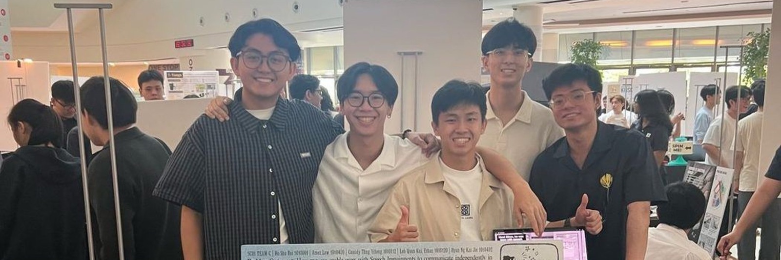
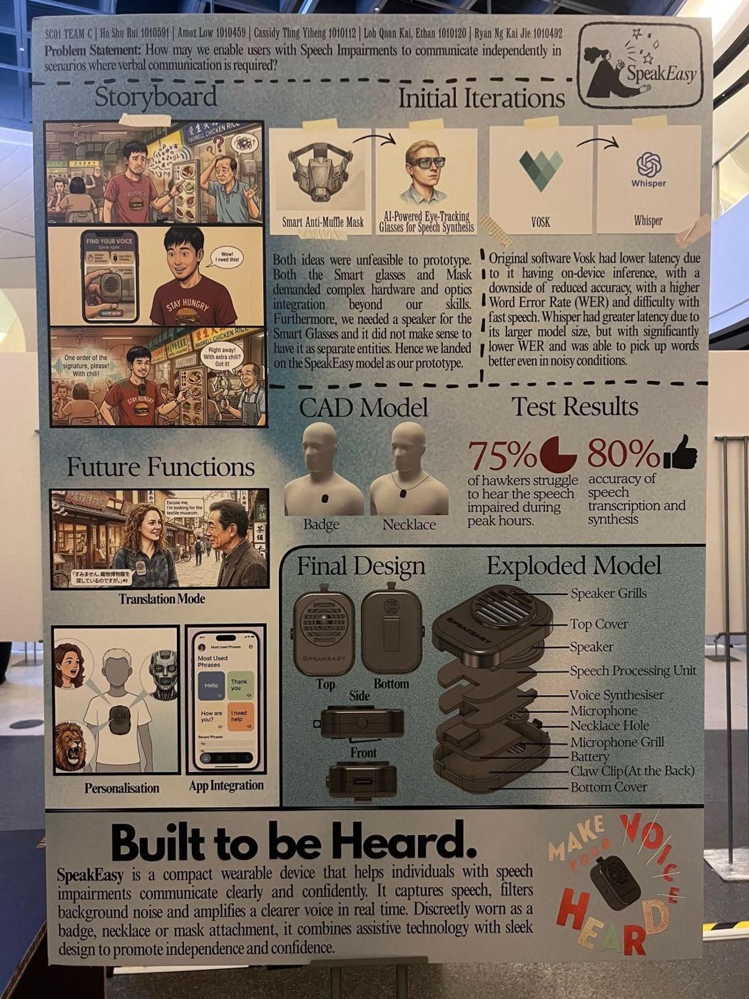
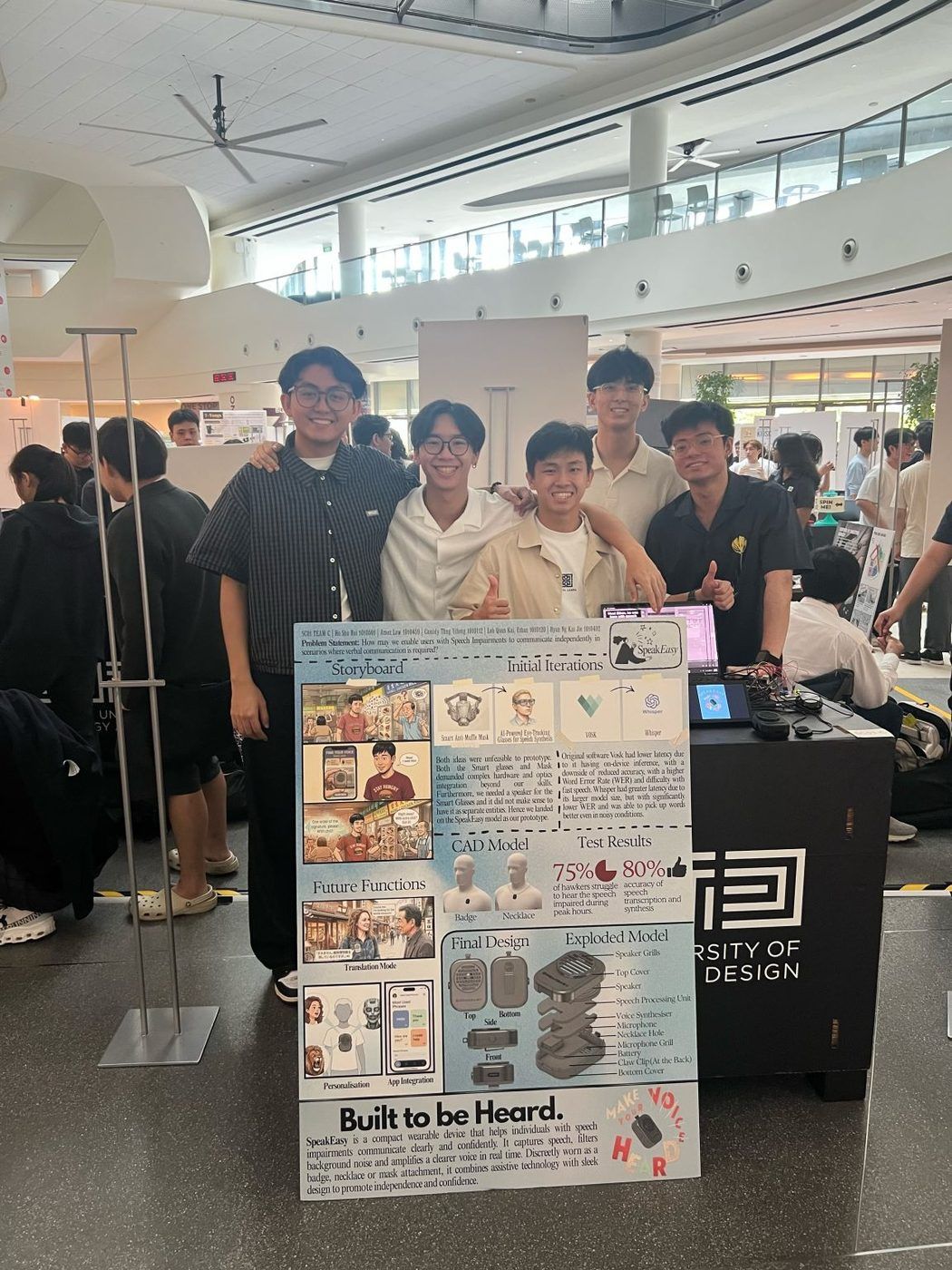
SpeakEasy began with one number: three in four hawkers in our research said they struggle to hear speech-impaired customers during peak hours. Behind that number is a person at the front of a lunchtime queue, trying to order a meal, and not being heard.
This project ended my old view of accessibility as a feature added at the end. The user was not an afterthought to the engineering. The user was the brief. Every technical decision had to pass one test first: does this help someone be understood, on their own terms?
That test killed our flashier concepts. A smart anti-muffle mask and AI eye-tracking glasses looked ambitious on a whiteboard, but they were bulky, conspicuous and too much to wear every day. A small badge or necklace asked almost nothing of the person wearing it: clip it on in the morning and forget it until it is needed. The most respectful design is often the one that draws the least attention to itself.
The same test decided our software. Vosk ran faster on the Raspberry Pi but made more errors. Whisper was slower and far more accurate, even in noise. On a spec sheet that is a simple trade-off. In real life it is the difference between a fast answer that is often wrong and a slower one people can trust. We chose with the user in mind, and we justified every choice against that standard.
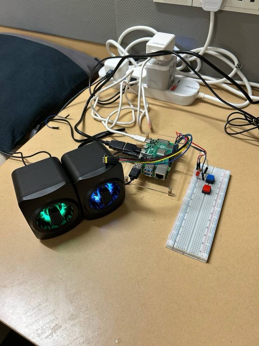
Building it was its own education. Our first prototype was a breadboard, a Raspberry Pi and two speakers on a desk. Turning that into a compact wearable inside a fully integrated CAD housing taught me how much design lives in the details: where the speaker sits, how the device hangs, how it feels after a full day.
80% accuracy in transcription and synthesis is a milestone, not a finish line. For someone relying on a device to be understood, "mostly works" is not enough. Every misheard word is a moment of frustration for a real person.
The next step is clear: test it at a real hawker stall at lunchtime, with real noise, real queues and real customers. That is where this design will be judged. SpeakEasy gave me a standard I now hold all my work to: technology is at its best when it helps someone be heard.
Cannon & Projectile Challenge
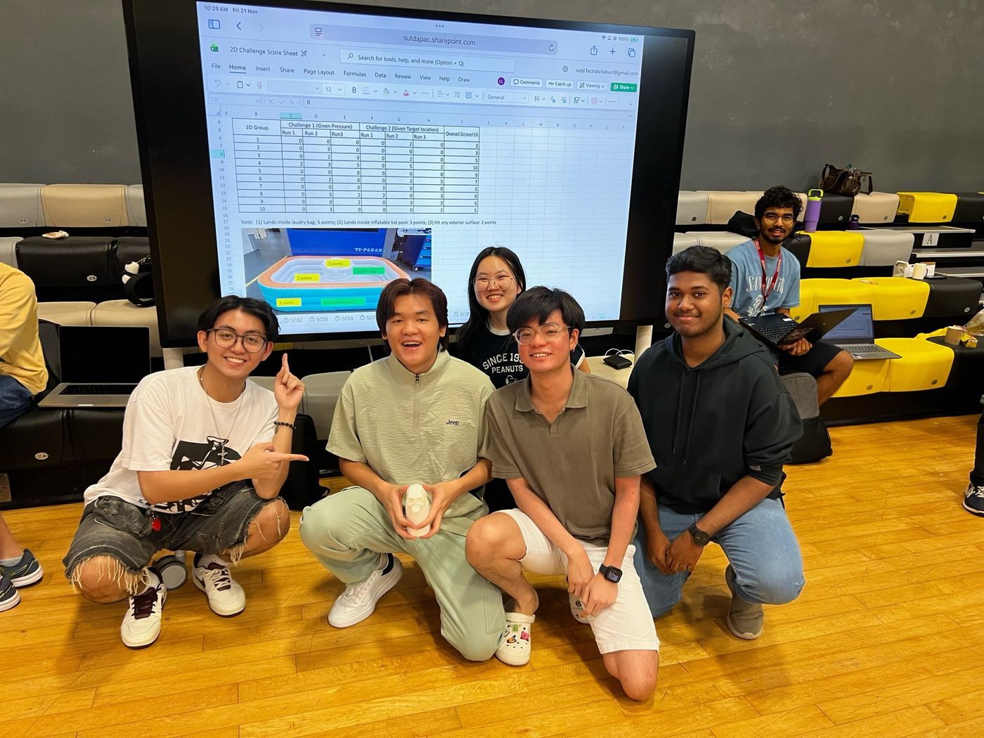
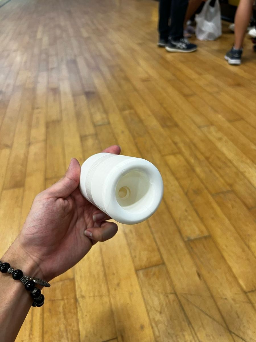
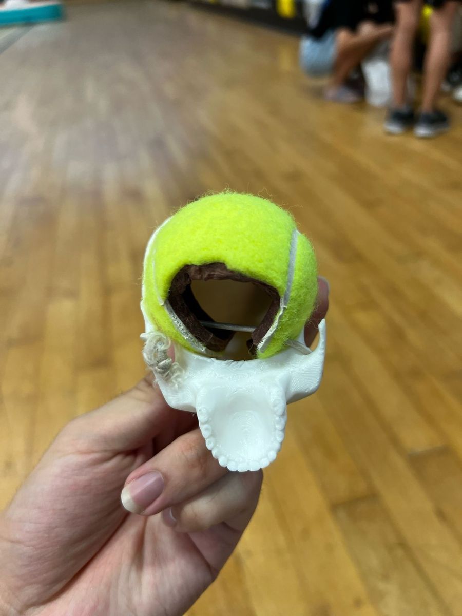
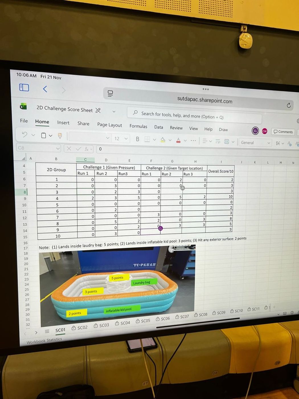
Looking back
One of my first projects at SUTD was aiming a tennis ball at a laundry bag, and it taught me the lesson every project since has repeated: theory is a starting point, not an answer.
On paper, projectile motion is the tidiest idea in physics. Choose an angle and a velocity, and the parabola does the rest. On the floor, that equation met the real world: 3D-printed parts, a tennis ball that never flew the same way twice, and a laundry bag that looked generous from the launcher and tiny once the ball was in the air. The gap between the two was where the real engineering happened.
A model is only as good as its calibration. Our predictions did not improve because the physics got more complicated. They improved because we fired, measured and adjusted, round after round, until theory and reality agreed. Every miss was data. Every adjustment closed the gap between where we said the ball would land and where it actually landed. I stopped treating failed shots as mistakes and started treating them as the most honest feedback we could get.
It was also my first real test of SUTD teamwork. Group SC01-4 had only just met. Calibration forced us to trust each other's measurements and split the work so that calculating, printing and testing ran in parallel. By the time we stood on the line for the scored shots, we were not four classmates assigned to a group. We were a team that had argued, adjusted and improved together.
Winning felt incredible. What matters more is the habit it started: predict, test, compare, refine. That loop drove the rubber-band car in the 1D Challenge, the speech wearable in SpeakEasy and every design decision I have made since.
This is where I learned how I design: I do not trust a perfect answer on paper. I test it against reality and let reality correct me. I will forget the exact launch angle we settled on. I will not forget the loop, and I am taking it into every classroom, lab and city that exchange puts in front of me.
Physical World 1D Challenge
Looking back
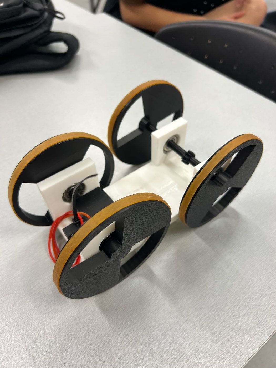
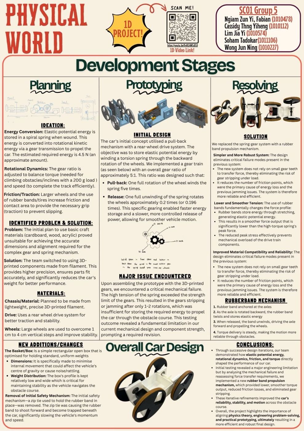
The moment that defined this project was our gear train stripping its teeth after two rotations. The design we were proudest of was the one that could not work.
That first prototype looked like serious engineering: a 5:1 gear train, a torsion spring storing energy, carefully modelled and printed parts. It failed because the spring's peak torque was more than printed teeth could survive. No amount of hope was going to change that.
When something breaks, the instinct is to defend it: thicker teeth, stronger infill, one more reinforcement of the same idea. We could have spent weeks patching a fragile system and calling it progress. We refused. We asked a sharper question instead: what does the car actually need to do? It needed steady torque, grip on steps from 1 cm to 4 cm, and a 200 g load held stable all the way to the finish.
Framed that way, the answers were obvious. A rubber band wound around an axle gave smooth, sustained torque without the violent peak that destroyed our gears. Oversized wheels with rubber-band treads gave grip. A low, wide basket kept the payload centred. Right before the run, we cut one more part, a zip-tie release that was snagging the band. The final car looked far less impressive than the gear train. It performed far better on the course, and on challenge day it climbed every step and delivered its load.
Removing complexity instead of adding it is the most important engineering lesson of my first year. It cuts against the instinct to make work look sophisticated. The best solution is not the one with the most parts. It is the one that solves the real problem with the fewest ways to fail.
The project also showed me how a team of five disagrees well: build it, test it, let the result decide. Testing the argument instead of arguing about it made every decision one all five of us could stand behind.
When I wrote my GEXP essay, the line I used to describe how I work came straight from this car: test early, find the real point of failure, then simplify. I apply it to code, posters and events now, and I intend to prove it in new team cultures overseas.
Life cycle analysis of a badminton racket
Looking back
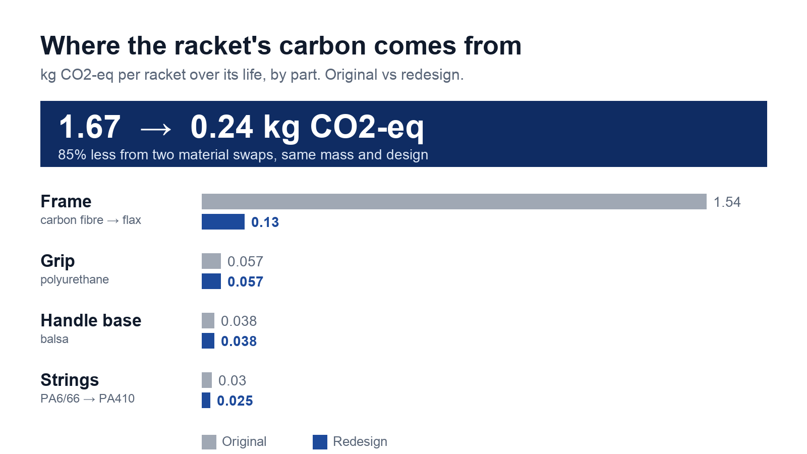
A badminton racket looks light and harmless: a frame, some strings, a grip. Life cycle analysis proved otherwise. Almost all of its 1.67 kg of CO₂ came from one decision, carbon fibre, made long before anyone stepped on court. The heaviest part of the racket was the part you cannot feel in your hand.
That changed how I look at every product. An object is not just the thing on the shelf. It is a story that begins in a factory and ends in an incinerator, a landfill or, if we design well, a recycling stream. Most of the impact hides in stages the user never sees: the extreme temperatures needed to carbonise fibres, the energy spent in processing, the route to end of life.
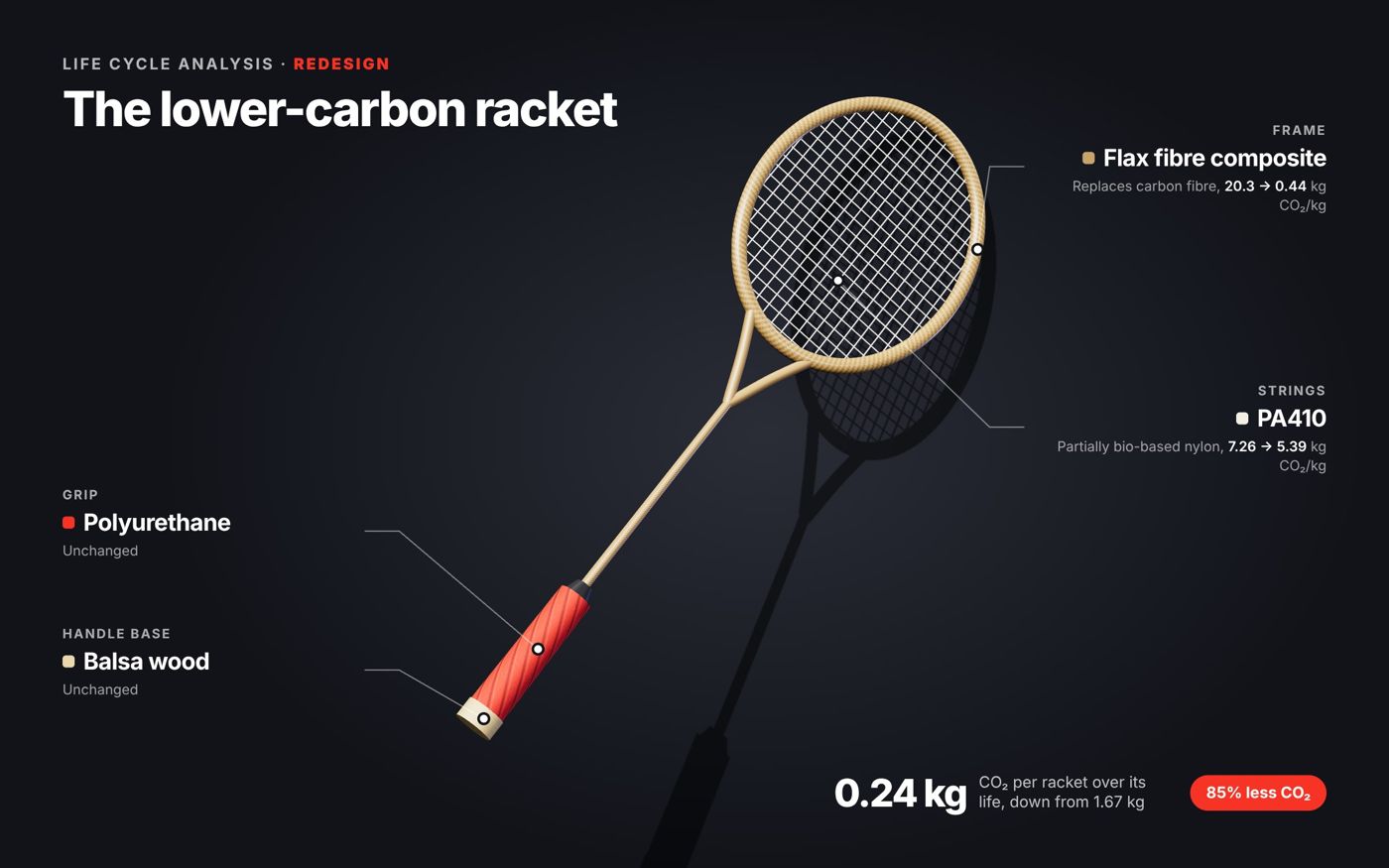
Granta EduPack taught me to treat materials as a chain, not a choice. Where do they come from? How much energy does it take to make them? What happens when they are thrown away? Answering those questions honestly meant modelling every component: the carbon fibre frame, nylon strings, polyurethane grip and balsa handle base.
The redesign is where engineering and sustainability met head-on. Flax fibre composite and bio-based PA410 were not magic swaps. Each had to earn its place on the property charts by matching the toughness and tensile strength a player expects. Picking the greenest material and ignoring performance would have been easy. Picking the best performer and ignoring the planet would have been easier. We refused both and found materials that did the job on court and cut the footprint from 1.67 kg to 0.24 kg of CO₂, about 85% less. One well-chosen decision changed almost everything.
My part was the goal and scope, inventory analysis and impact assessment: deciding what to measure before anything was measured. Where does the system boundary sit? Which stages count? What makes the comparison fair? It is quieter than printing a prototype, but it determined every result that followed. A study with the wrong scope produces confident numbers that answer the wrong question.
That lesson runs straight into the analytics side of my studies. Whether I am modelling a racket, a supply chain or an investment, the numbers are only useful if the question is right. It also gave me a clear-eyed view of sustainability: material substitution helps, but real change comes when better materials meet better processes and smarter design from the start.
On exchange, I want to see how other countries design for sustainability and bring the best of it back to SUTD.
Domus Orationis: a house of prayer
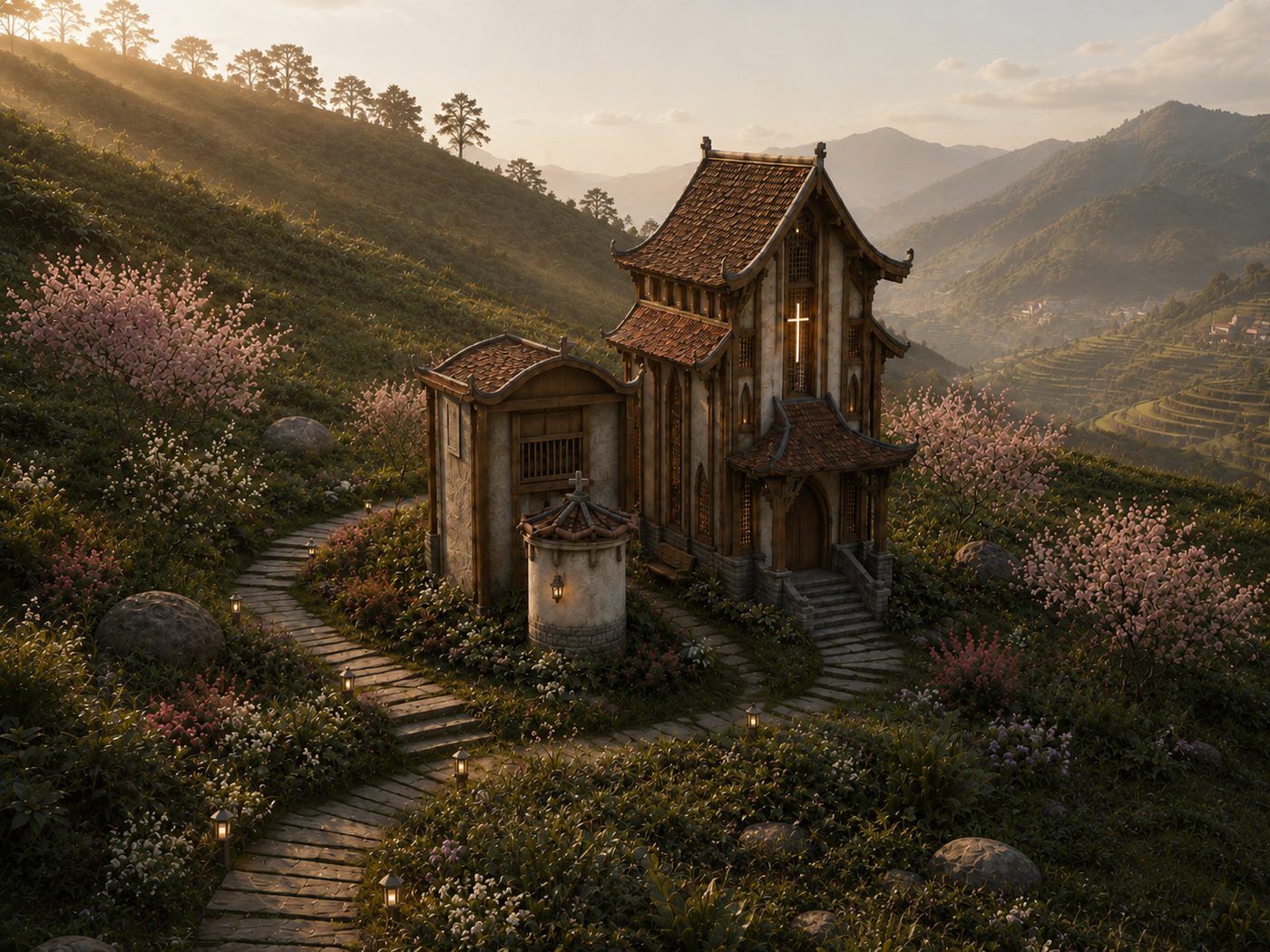
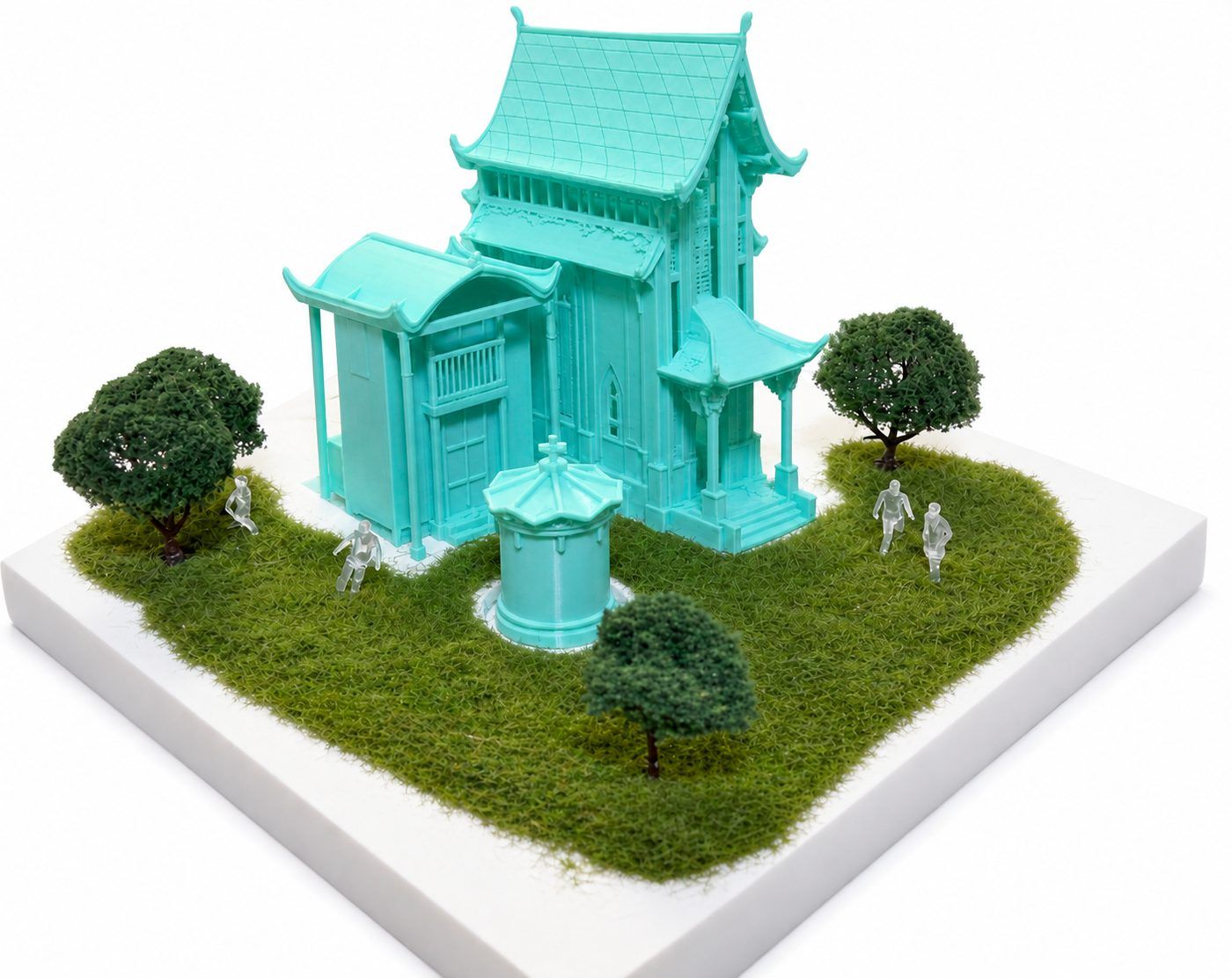
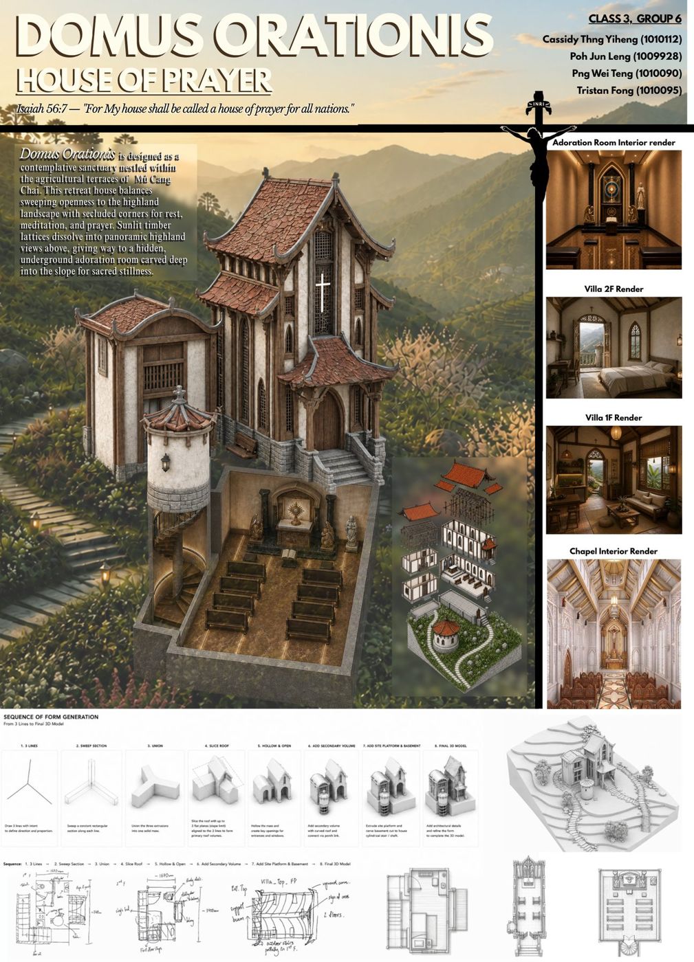
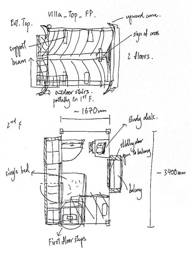
Looking back
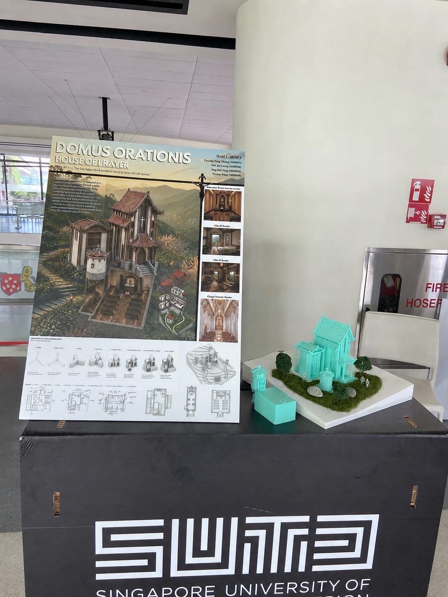
Domus Orationis asked a question I had never faced as a designer: how do you build for silence? Everything I had made before was built to act: cars that move, launchers that fire, devices that compute and speak. A house of prayer does the opposite. It slows people down, cuts out the noise and makes room for something beyond the everyday.
That brief drove every decision. We set the house among the terraced rice fields of Mù Cang Chải in Vietnam's highlands, a landscape that is already contemplative. The upper floors open to the light and the hills through sunlit timber lattices, so the view becomes part of the prayer. Below, the adoration room is carved into the slope, hidden and reached by a spiral stair.
That descent is the heart of the design. Walking down into the ground, you leave the bright views behind step by step and arrive somewhere darker, quieter and enclosed. By the time you reach the adoration room, the architecture has already prepared you for stillness. In architecture, the way you arrive at a space matters as much as the space itself. Design is not only about objects. It is about journeys.
The form grew from almost nothing: three lines, swept into volumes, joined, sliced into roof planes and hollowed out, then extended with a second volume, a platform and the basement stair. From that came a chapel, a two-storey villa for rest and study, and an underground room for prayer. A clear idea, pursued with discipline, can carry an entire building.
The project also took me through every scale. My individual exercises started with my own room, at 1:10 in plan, 1:15 in 3D and 1:300 in the city. By the end, our group was setting a retreat house into a mountainside. Each medium told a different truth: a sketch captures intent, a plan tests logic, a render tests atmosphere, and a 3D-printed site model shows how everything sits in the land.
Working with Jun Leng, Wei Teng and Tristan taught me how to hold a shared vision. A sacred space has to feel coherent, so every element, from the lattice to the stair, had to belong to one idea. Getting four people there took conversation, compromise and relentless iteration.
Faith is a big part of my life outside class, so Domus Orationis was more than an assignment. It was a chance to design for stillness in a world that rarely stops moving. I intend to keep studying how architecture makes room for people to pause, and exchange will put new sacred spaces, in new cities, right in front of me.
Design Computation: generative and parametric
Looking back
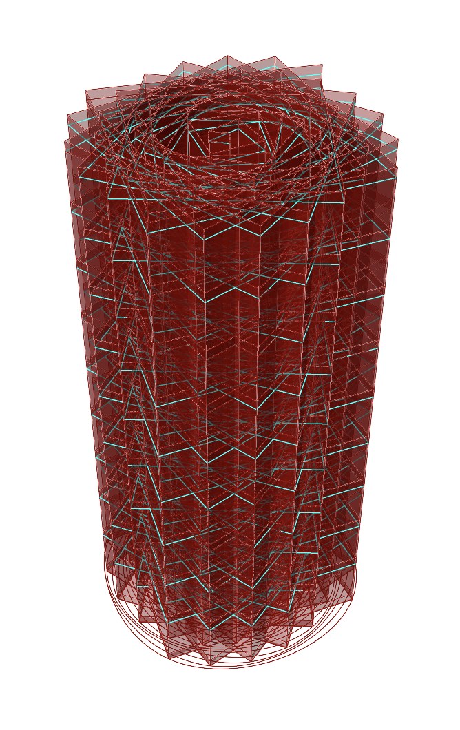
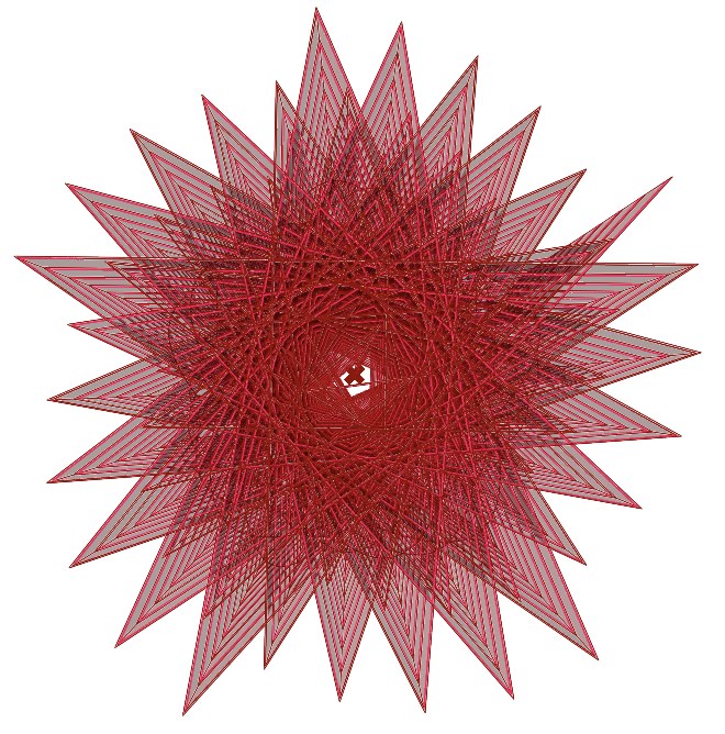
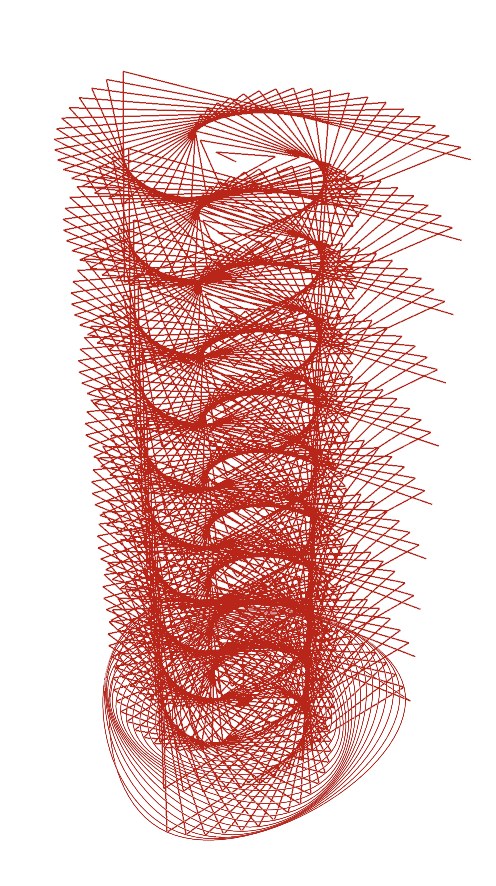
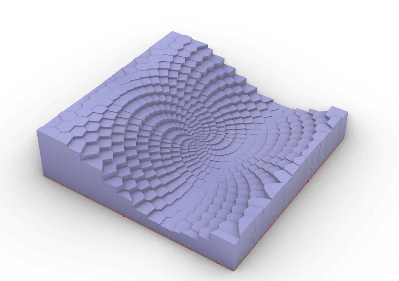
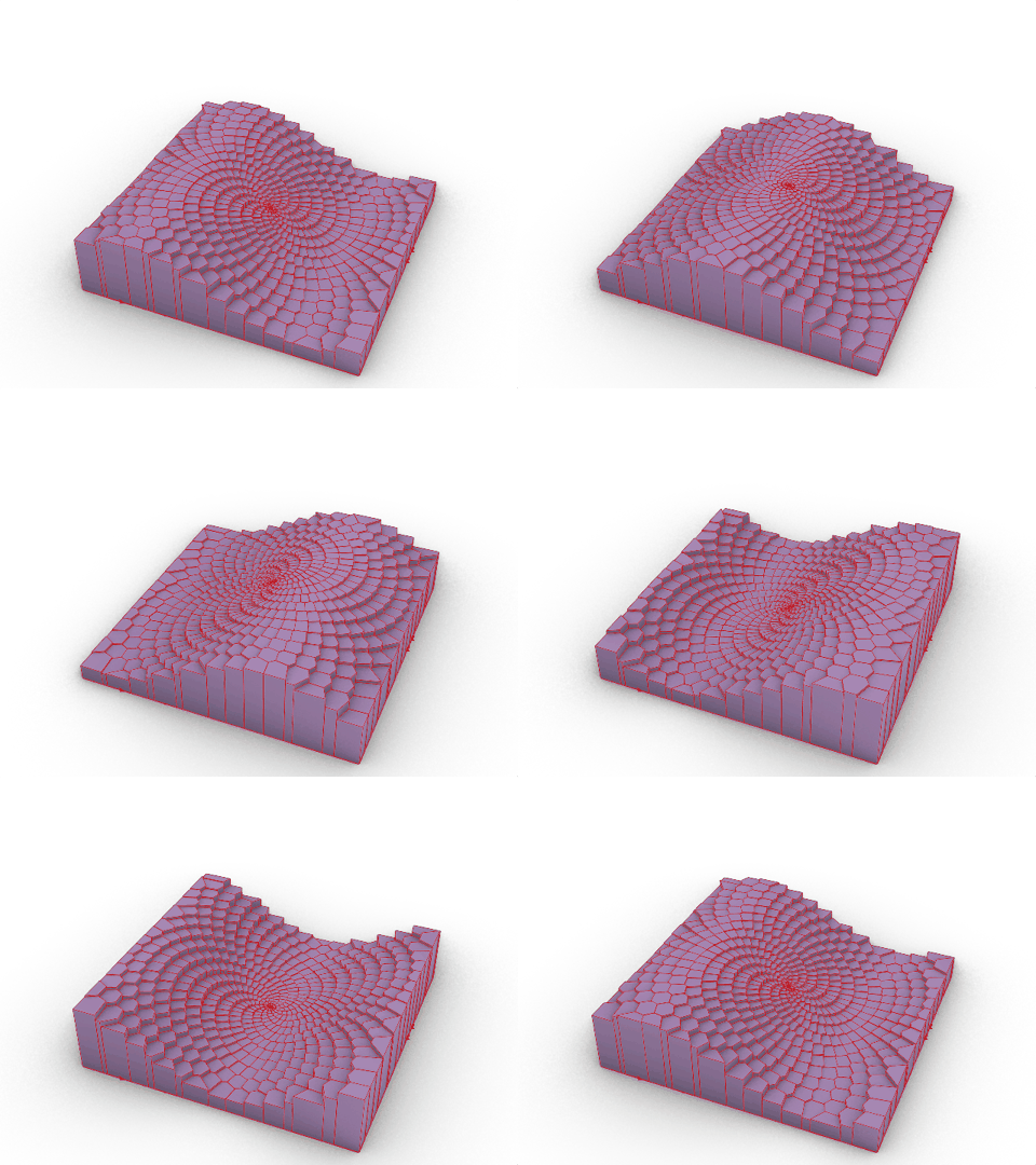
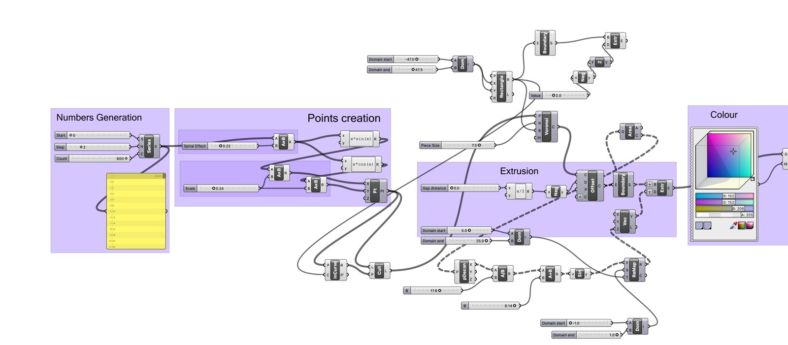
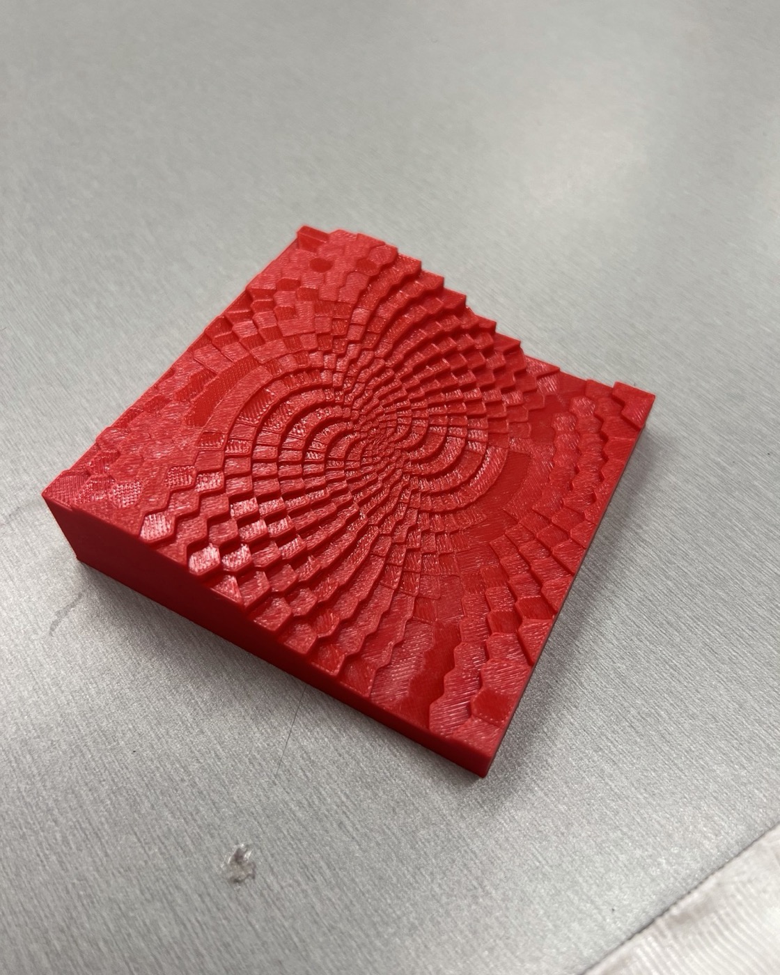
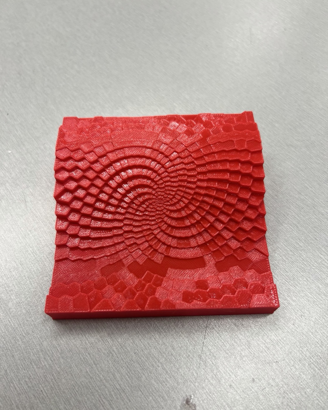
Design Computation turned design into a conversation. A traditional model is a shape that sits there, finished and silent. In Grasshopper, you set the rules and the geometry answers back. Turn the rotation angle from 179° to 70° and a dense coil breathes open into something organic. Scrub one phase slider and a whole landscape ripples like water. I stopped asking "what should this look like?" and started asking "what should this be allowed to do?"
That shift was hard. For most of my life, design meant arriving at one answer. Computational design means designing the process that generates answers, then having the judgment to choose between them. At first it felt like giving up control. By the end of the term it was the opposite: I could see far more possibilities than I could ever draw by hand.
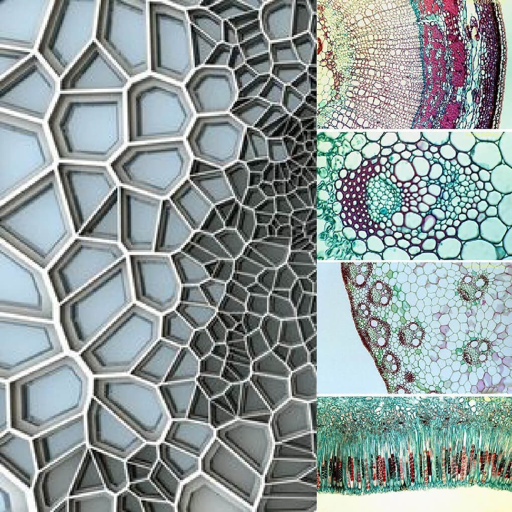
Both projects borrowed from nature: phyllotaxis and the Golden Angle in the shell, plant-tissue Voronoi in the wave. Plants worked out many of the most efficient forms in the world long before software existed. Our job was not to out-invent them, but to translate their rules precisely, and to catch the moment the translation broke.
It broke in the "Voronoi shuffle". Trimming cells at the boundary scrambled the data order, and the edge pillars shot up to extreme heights. Nothing in the script looked wrong. The data and the geometry had silently fallen out of step. Tracing it back and locking each height to its own cell's centroid taught me what debugging really is: patient, systematic and unforgiving of shortcuts. The most frustrating bugs teach the most.
Then the script became an object. For weeks the wave existed only as numbers, curves and sliders on a screen. It came off the printer as a small red block I could hold, every cell catching the light at a different height, the spiral rippling out from the centre exactly as the sine wave promised. Making it print-ready, fusing the pillars into a solid 2 mm floor so it became one watertight piece, was the final step from idea to reality. That moment made every hour of debugging worth it.
I also learned to work with AI on my own terms. I used it to brainstorm, troubleshoot scripts and cut print time, while every design decision stayed mine. Using powerful tools while keeping ownership of the thinking is a balance that will only matter more in my Design and AI studies.
The habit I keep is thinking in systems instead of single answers: build a model, expose the variables that matter, explore the full range, then make a decision I can defend. The A− was a great result. The real reward was learning to see design as a living system rather than a fixed shape.
Reading Museum Silences
Looking back
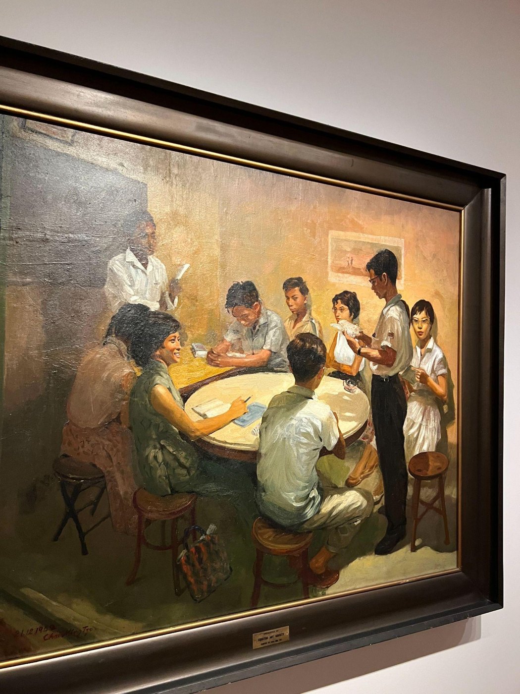
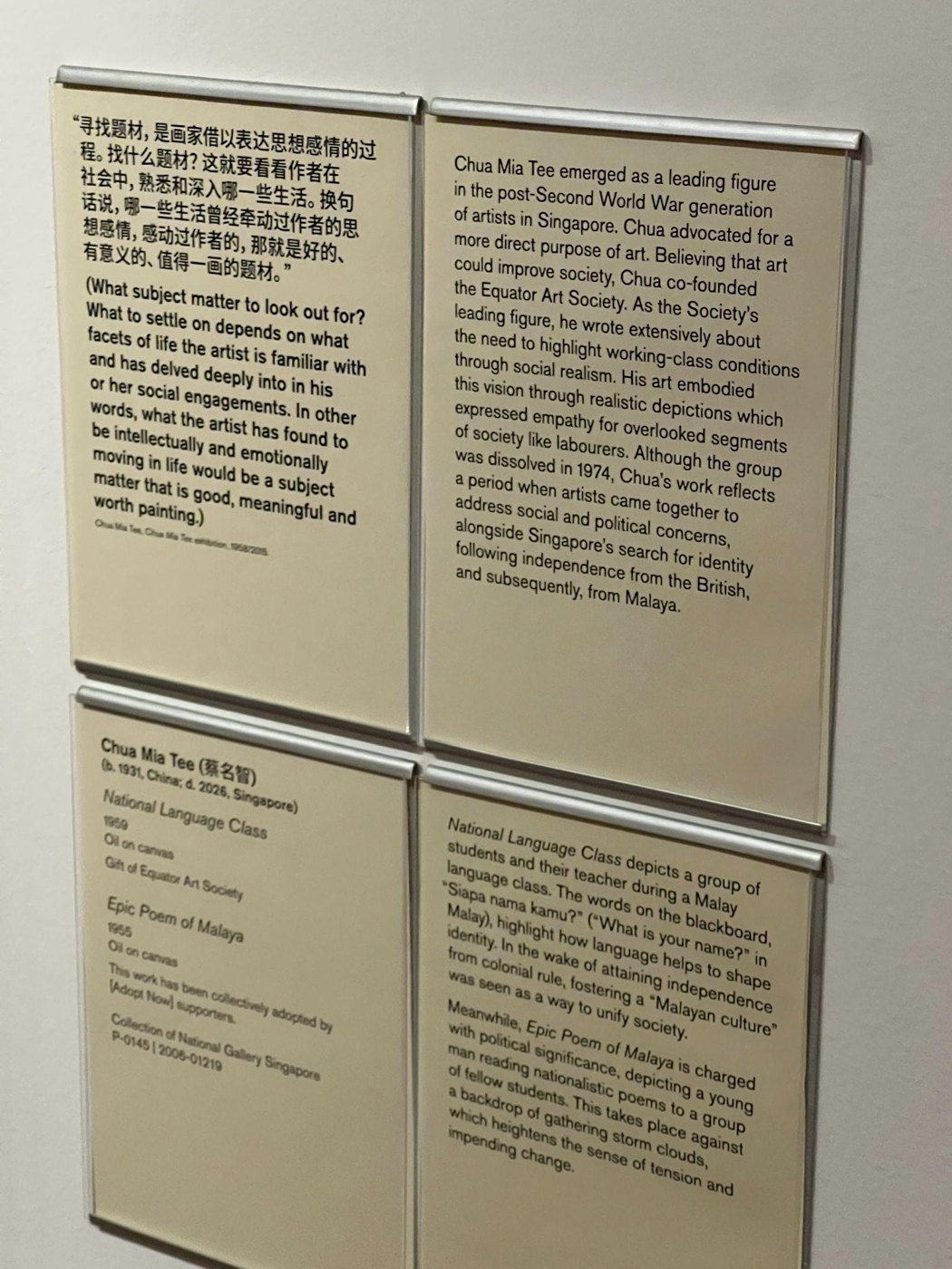
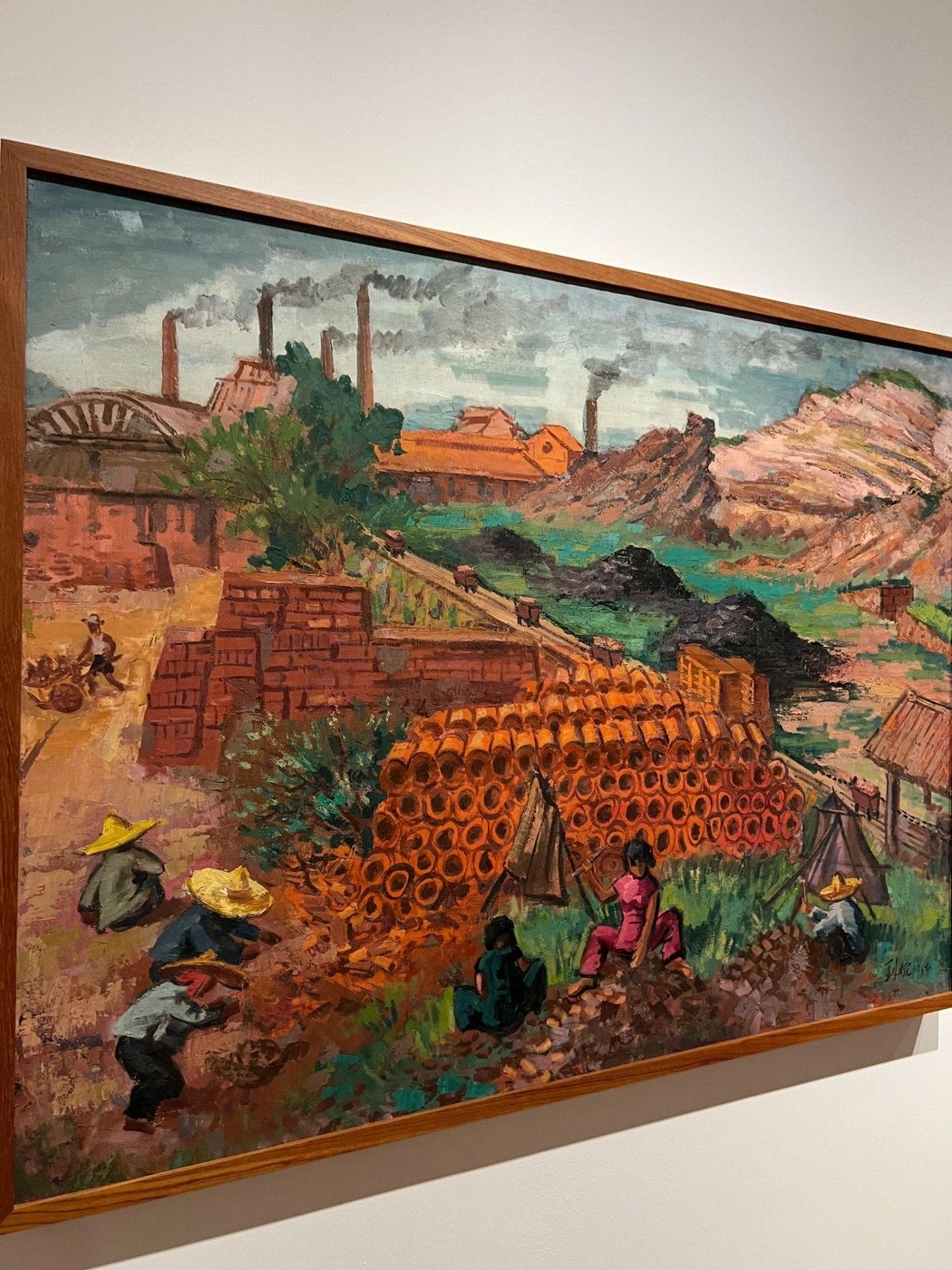
This assignment rewired how I see every curated space. I had always visited museums as a viewer: walk through, admire the work, read a label, move on. Trouillot taught me to read the Gallery as a set of decisions. Which works were acquired? Who wrote the labels? Which stories hang at eye level, and which sit behind glass?
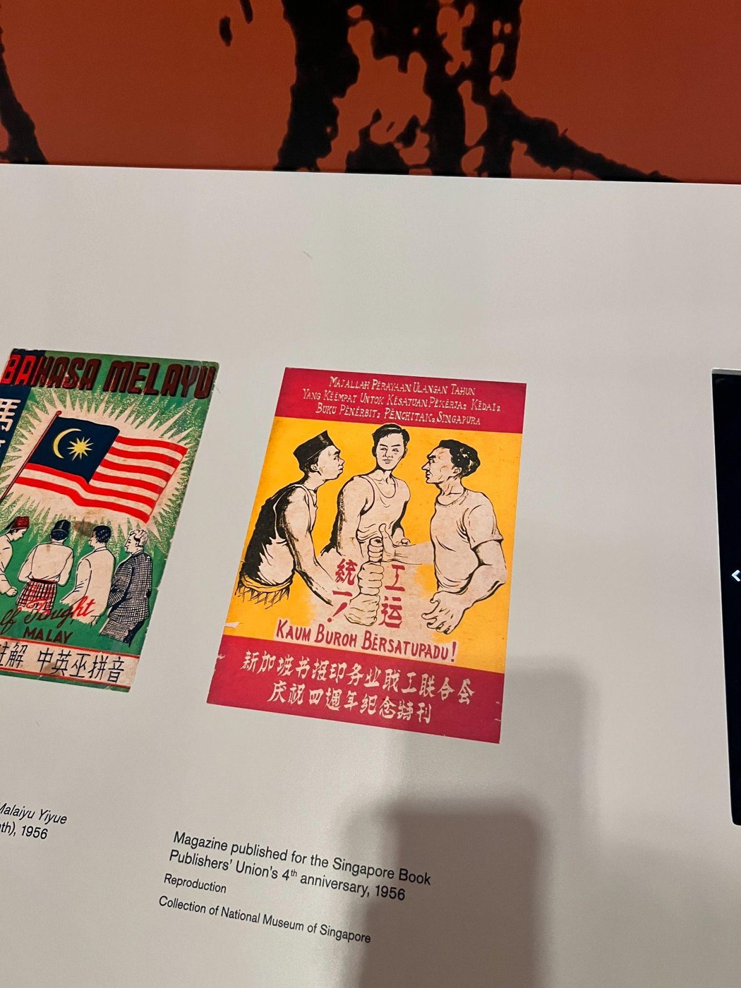
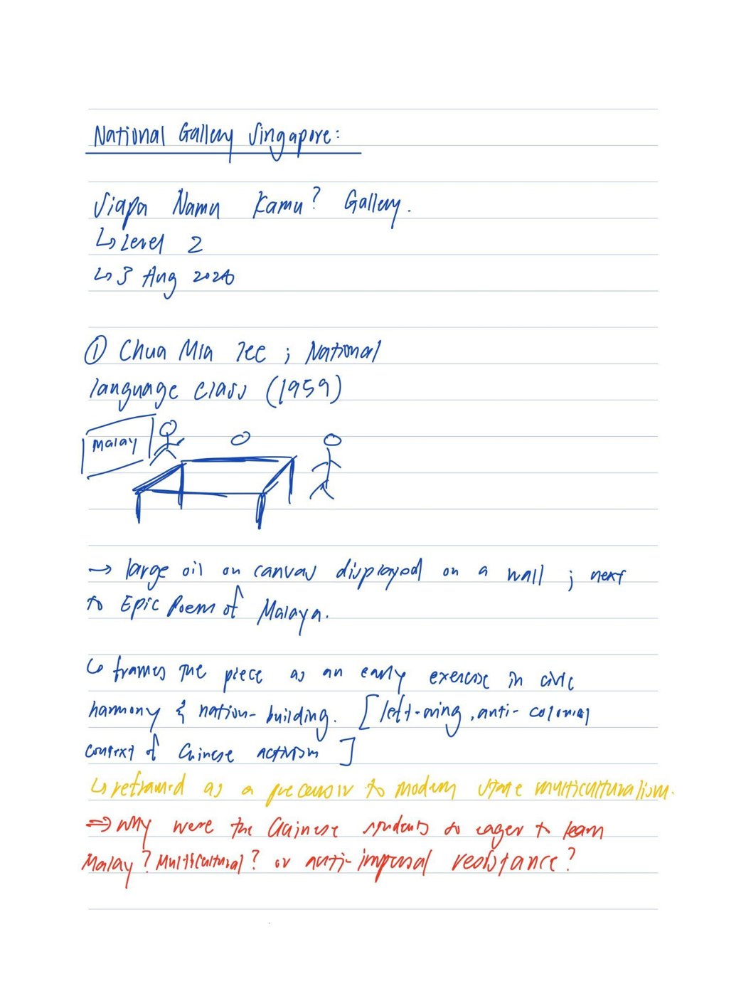
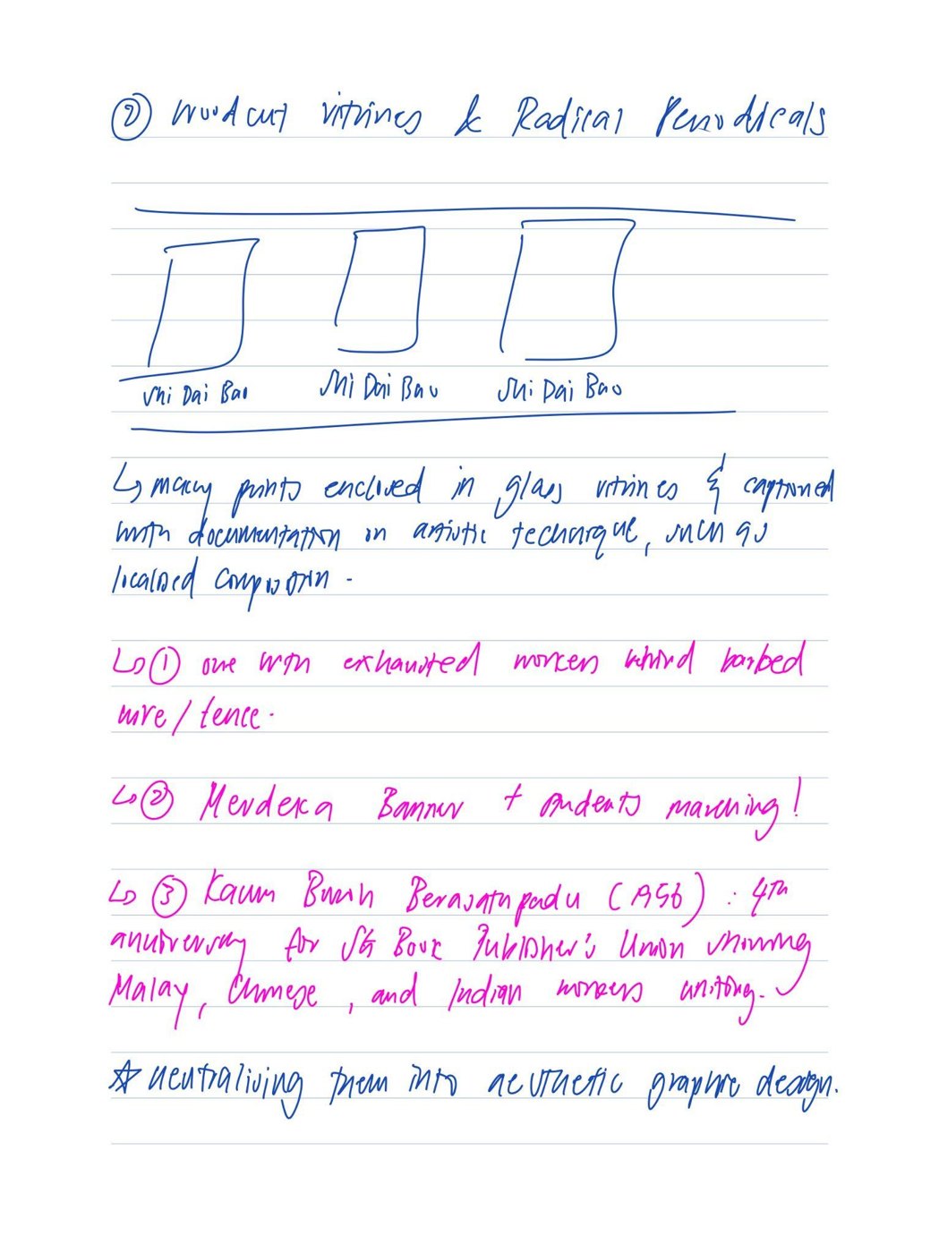
The silences worked gently, and that is what made them powerful. Nothing on the walls was false. The labels were accurate about technique, composition and dates. The silence lived in what they left out: the student activism behind learning Malay in 1959, the colonial ban on the unions behind the woodcuts, the kampong communities displaced on the road to a global city-state. It also lived in me, in how naturally I had accepted that framing for most of my life.
The woodcuts were the turning point. My designer's instinct was to admire the carving, the contrast and the composition. Only on a second look did I see the people in them: workers on strike, struggling and organising. Beauty had let me look straight past suffering. That forced a harder question: what else had I been trained to look past?
None of this made me love the Gallery or Singapore less. It made me care more. A nation's story is stronger and more honest when it has room for its struggles alongside its successes. Seeing the silences is not rejecting the official story. It is learning to hold more than one story at once.
Fieldwork gave me a new way of working. An afternoon with a notebook, recording where each work hung and what each label left unsaid, was the opposite of fast prototyping. It was slow, disciplined observation, and it produced the evidence my entire argument stood on. Careful looking is a design skill.
I now carry Trouillot's question into everything I make. A poster, an interface, an exhibition, a portfolio: each frames a story, and each leaves something out. Those choices are unavoidable, but I can make them deliberately and ask whose voice is missing before I call anything finished. In technology, where what a product leaves out shapes what millions of people see, that question matters even more.
This portfolio is a curated space too. Every photo and every sentence here is a decision about what to show, and I have built it honestly. On exchange, I will be listening for the silences in every new city, and looking for the stories that are not on the wall.
Mission trip campaign
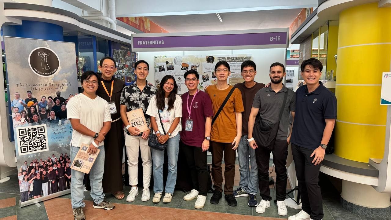
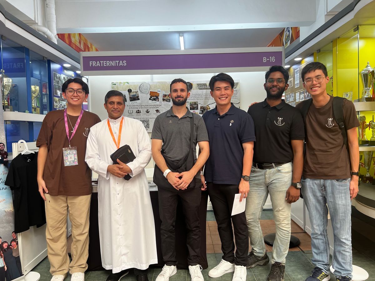
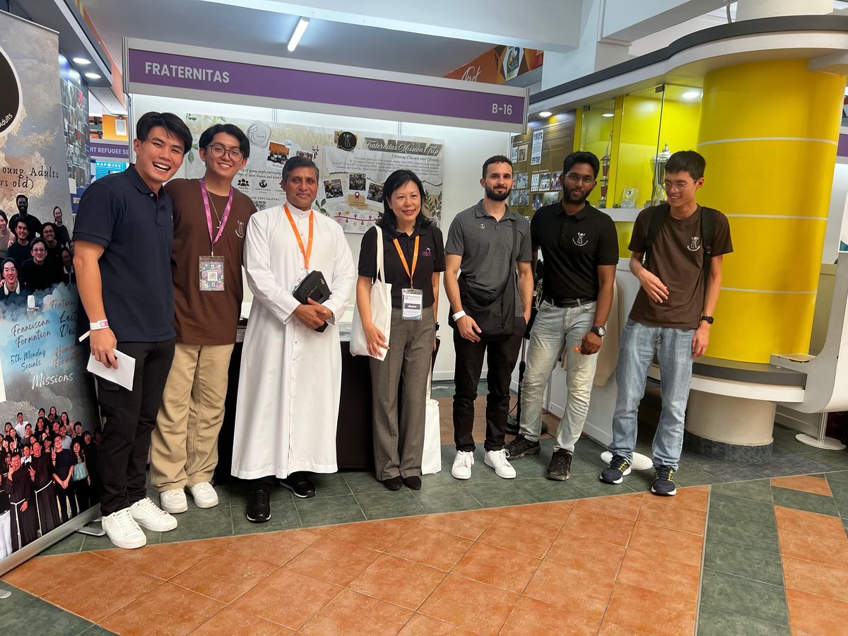
Looking back
Promoting a mission trip is not selling a product. It is asking people to give their time, travel somewhere unfamiliar and serve people they have never met. No poster can make that decision for anyone. A poster's job is to make someone curious enough to stop, look and ask. Everything after that depends on people.
That shaped our whole approach at the CHARIS event. We designed the mission display board to tell the trip's story at a glance, so anyone walking past understood in seconds what the trip was and why it mattered. Beside it, the Franciscan Young Adults stand gave a gentler first step to anyone curious about the community but not yet ready to commit to a journey overseas.
Partnering with CHARIS showed me how much more two groups can achieve than one. It meant planning around shared goals, not just ours. We aligned our message with theirs, shared a space with respect and made sure every visitor left with a clear next step, whether that was signing up for the trip or simply getting to know the community. Collaboration is not compromise. It is reaching people neither group could reach alone.
The conversations were the core of the campaign. Talking with young people about what the trip would demand of them, and what they would gain, took honesty as much as enthusiasm. Overselling it would have been easy. We were straight about the challenges and genuine about the rewards, because the people who sign up for the right reasons are the ones who come back glad they went.
From June to December 2025, volunteer interest grew. That growth did not come from one clever design. It came from steady, patient work: a well-designed board, a welcoming stand and conversation after conversation, one person at a time.
This campaign brought together what I care about most: design, storytelling and people. Outreach is hospitality. The display board opens the door; the conversation afterwards welcomes someone in. Design draws people closer. Relationships make them stay.
That is exactly how I will work as an SUTD ambassador. Promoting SUTD to students overseas, or sharing my exchange with juniors back home, is the same job as promoting a mission trip: not selling an experience, but helping someone picture themselves in it, then being there to answer their questions honestly.
Photography: thirty-six frames at a time
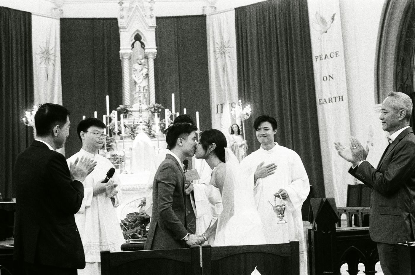
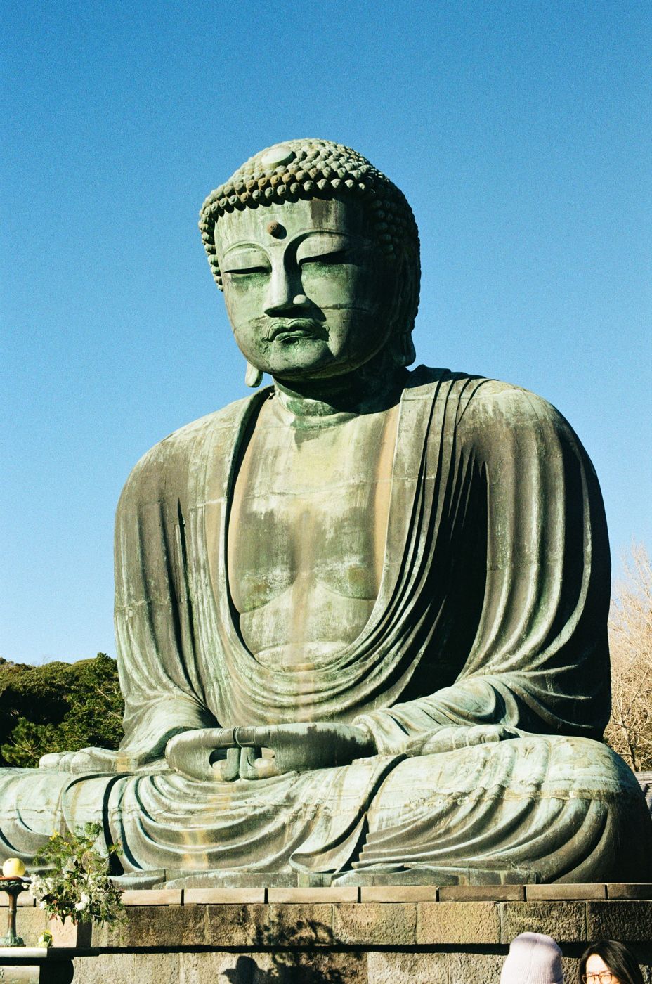
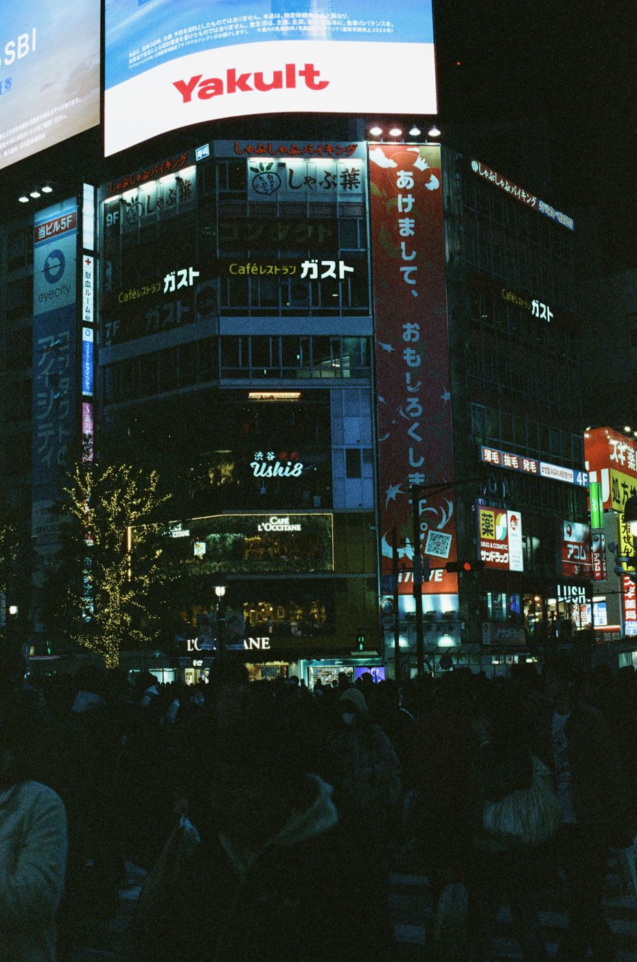
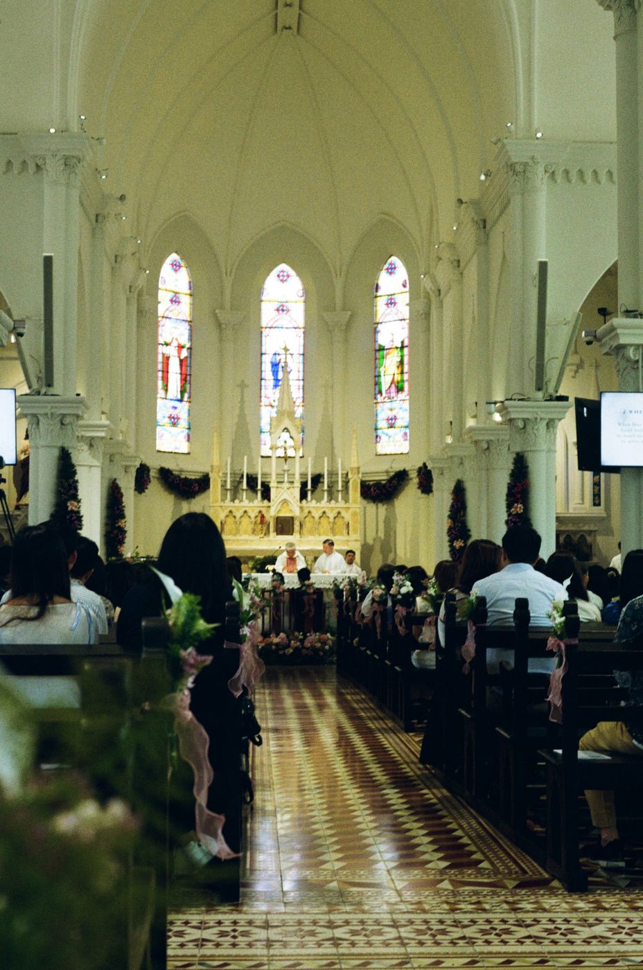
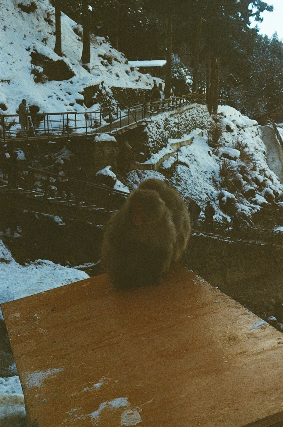
Looking back
I picked up photography in 2020, and it has shaped how I see everything since: light on a wall, the shape of a crowd, an expression that crosses someone's face for half a second and disappears.
Film taught me the most. No screen to check, no burst mode, a fixed number of frames on a roll. On my Nikon F2 and Fuji GW690II, every press of the shutter costs something, so I slow down, wait and decide what is worth keeping before I take the picture, not after. That discipline forces me to be fully present, and it is exactly why I love it.
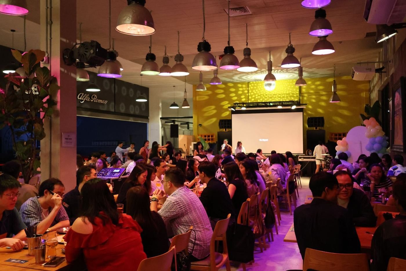
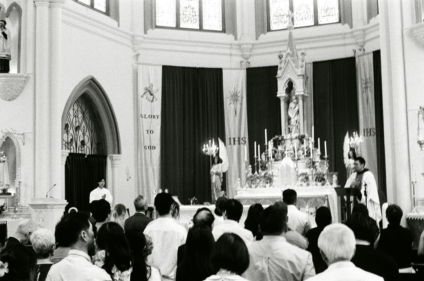
The work I value most is the work people trust me with. Photographing a friend's wedding or a community event means being present for something that matters deeply to someone else while staying out of the way. Shooting Dillon and Gzenn's wedding entirely in black and white is one of the most meaningful things I have done with a camera. I was not just documenting a ceremony. I was holding a memory two people will return to for the rest of their lives. That is a privilege and a responsibility, and I treat it as both.
The best frames are almost never the posed ones. They are the half-second before a laugh, a hand on a shoulder, a glance across the room nobody else caught. Getting them means anticipating them: reading the rhythm of a room and trusting my timing. Photography has made me more patient and more observant, behind the camera and away from it.
Travel sharpens that eye. From the Great Buddha at Kamakura to the night streets of Tokyo and the snow country of Japan, a camera comes everywhere I go. It turns every trip into a study of a place: its light, its pace, its people. More than 130 posts on @cassidy.films are how I keep those places alive.
Photography is a design discipline. Composition, light, timing and editing are all decisions about what to show and what to leave out. It is the same eye I bring to posters, publicity and prototypes, and it is the reason I care so much about how things look and feel.
On exchange, I will keep a weekly photo and video journal. The camera will do what it has always done for me: make me pay attention, and let me share what I find. Those images will give future SUTD students an honest, beautiful picture of life abroad, and give me a record of everything I saw.
Fifth Row and campus life
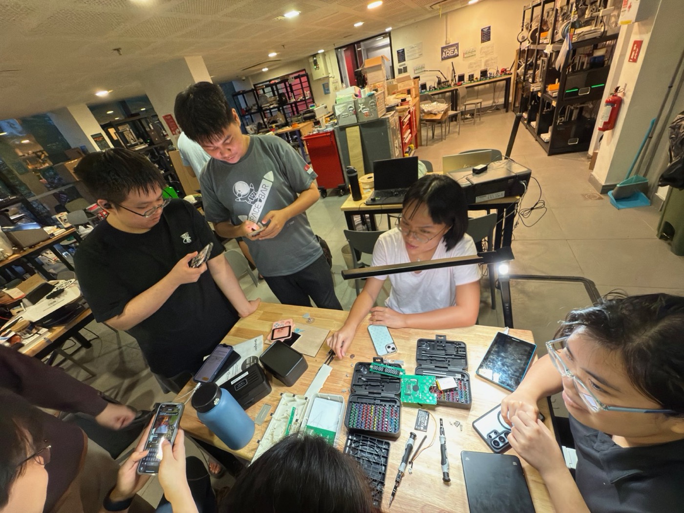
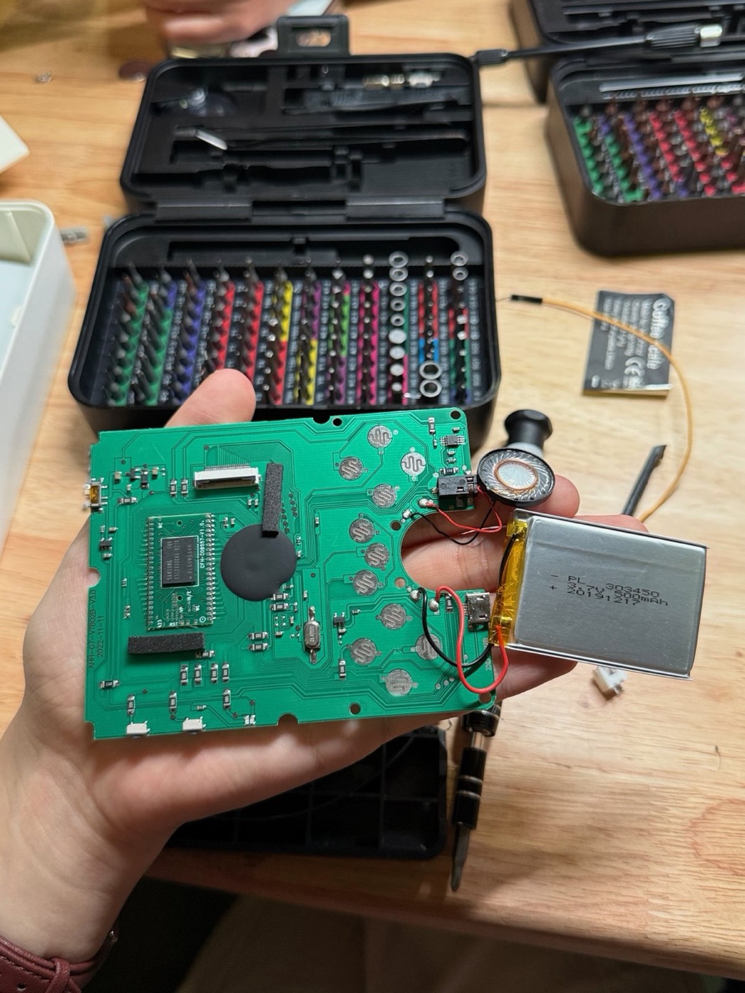
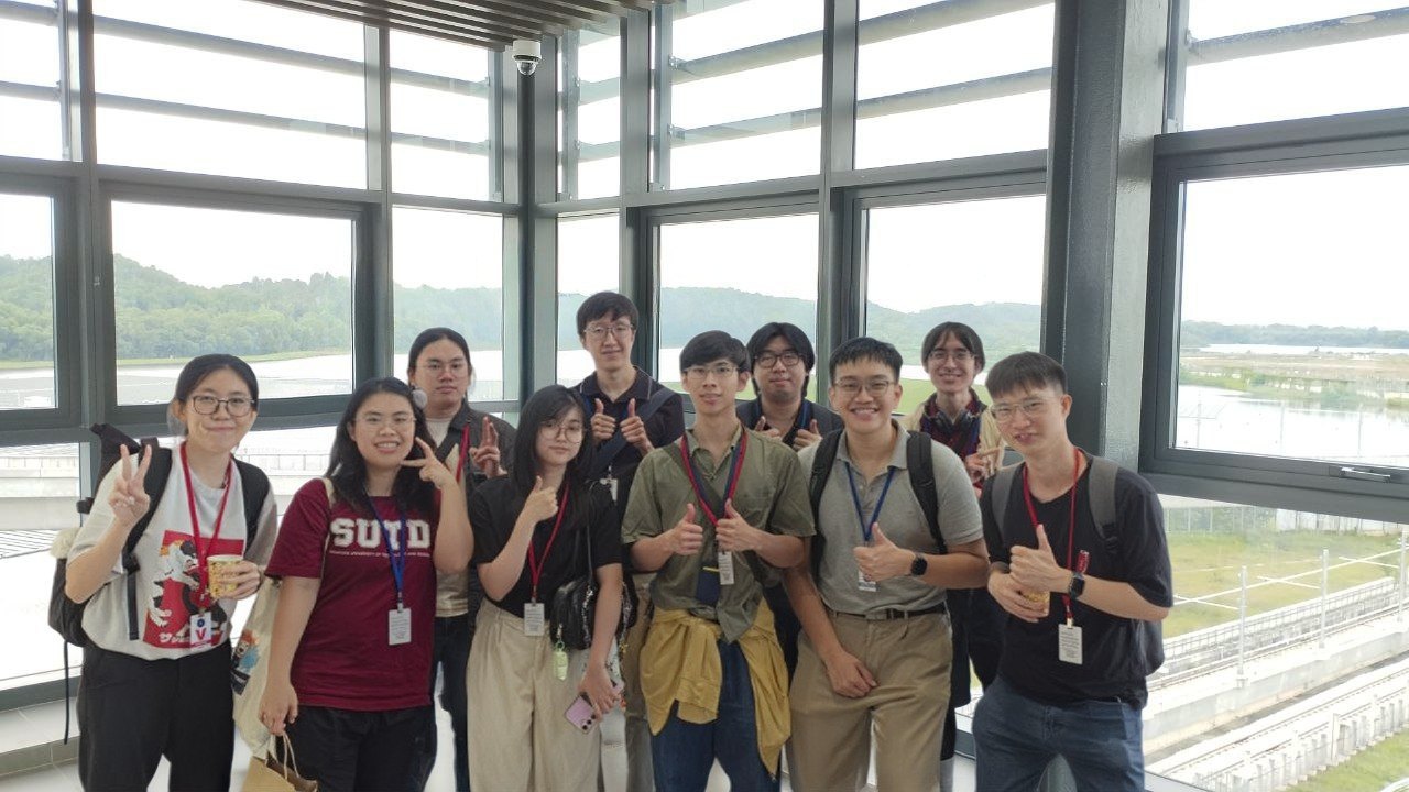
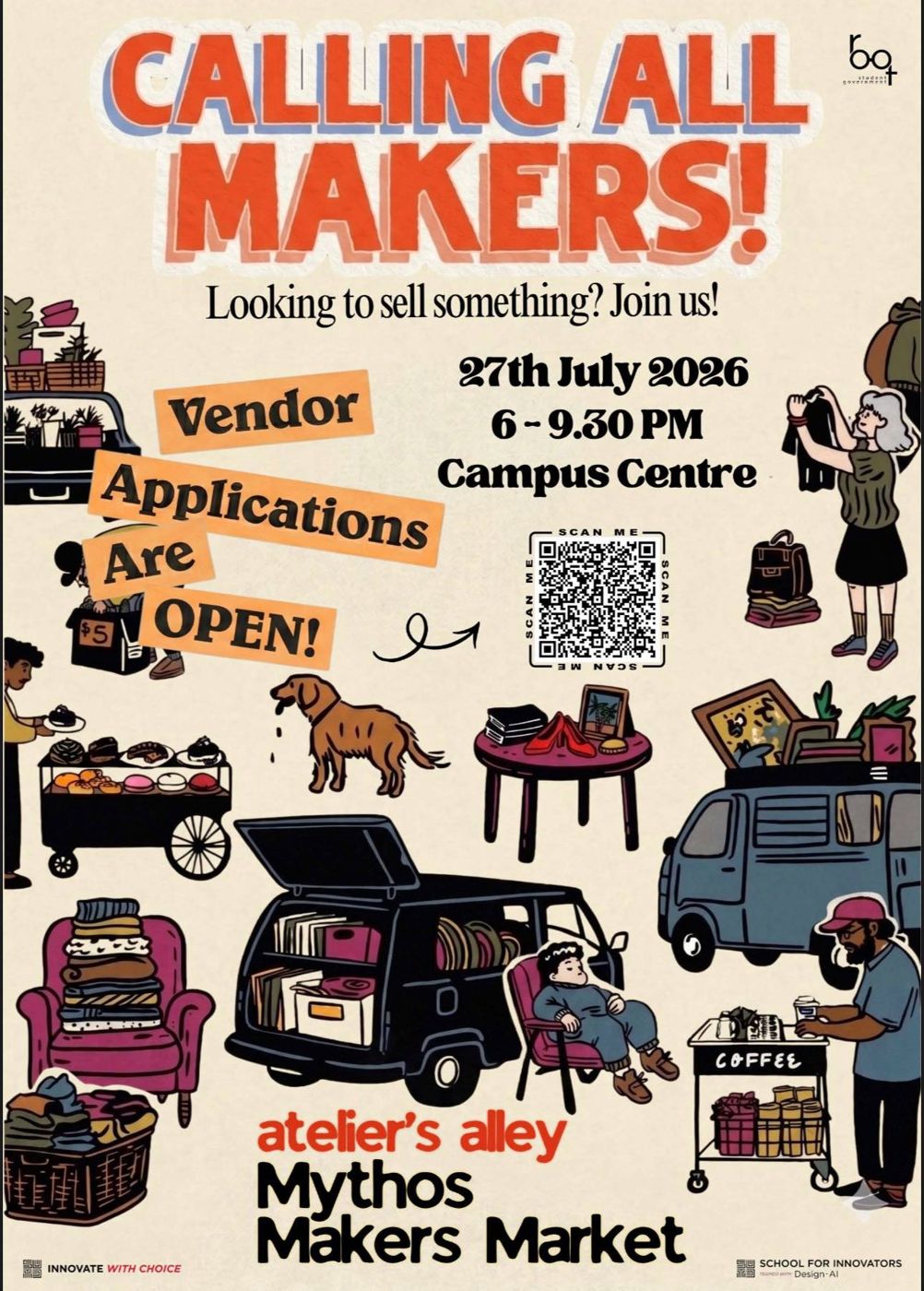
In short
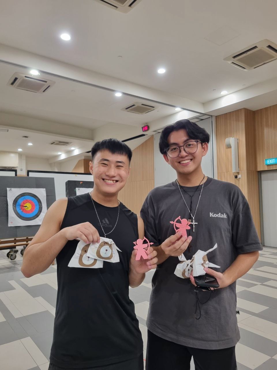
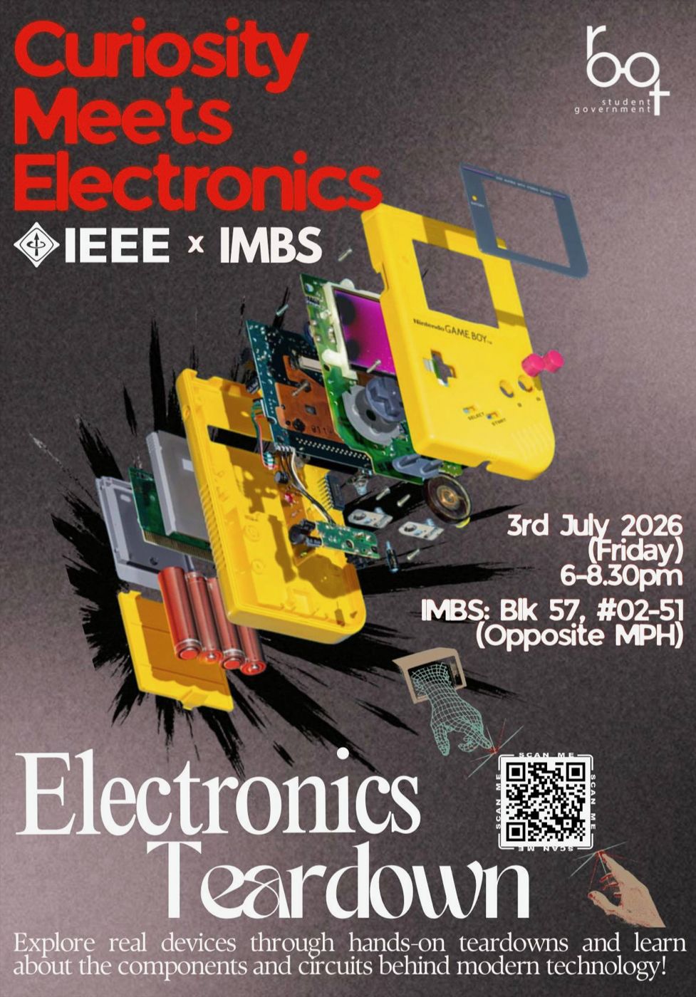
Outside class I serve as House Secretary of Mythos, my residential college, as Publicity Lead for IEEE and as Tech Lead for IES. That means posters, events and teardowns, and a fair amount of sport.
My SUTD journey
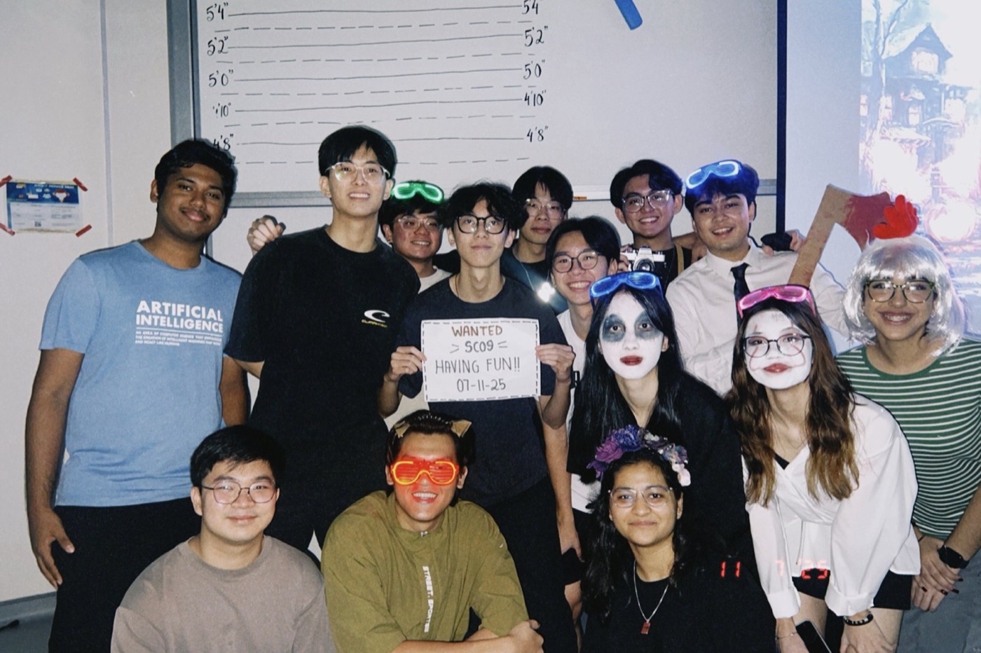
In short
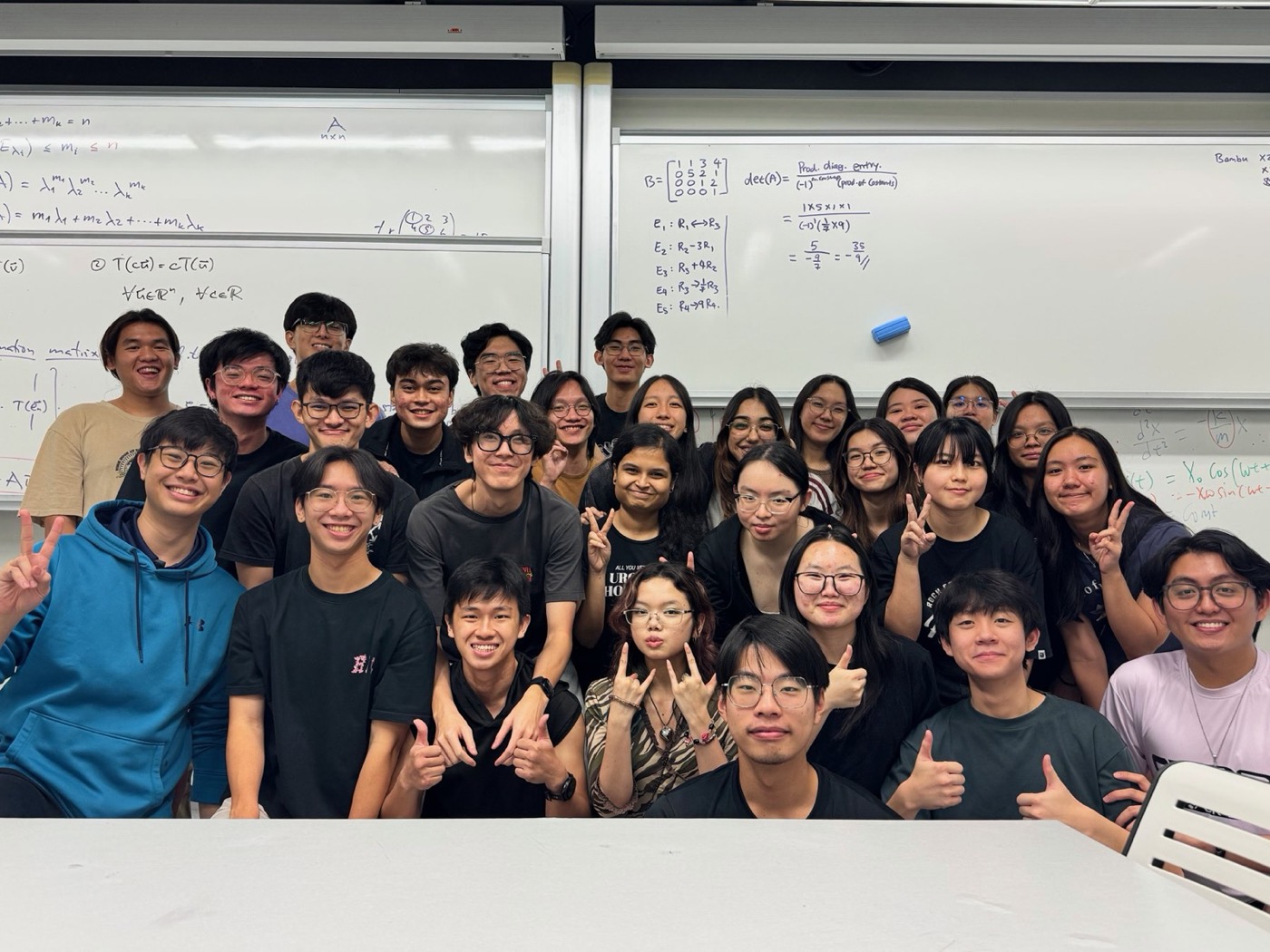
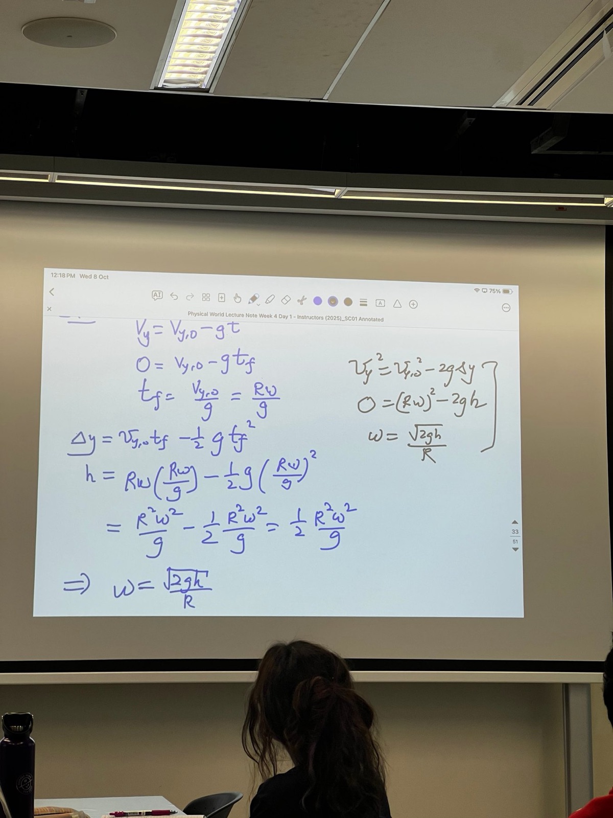
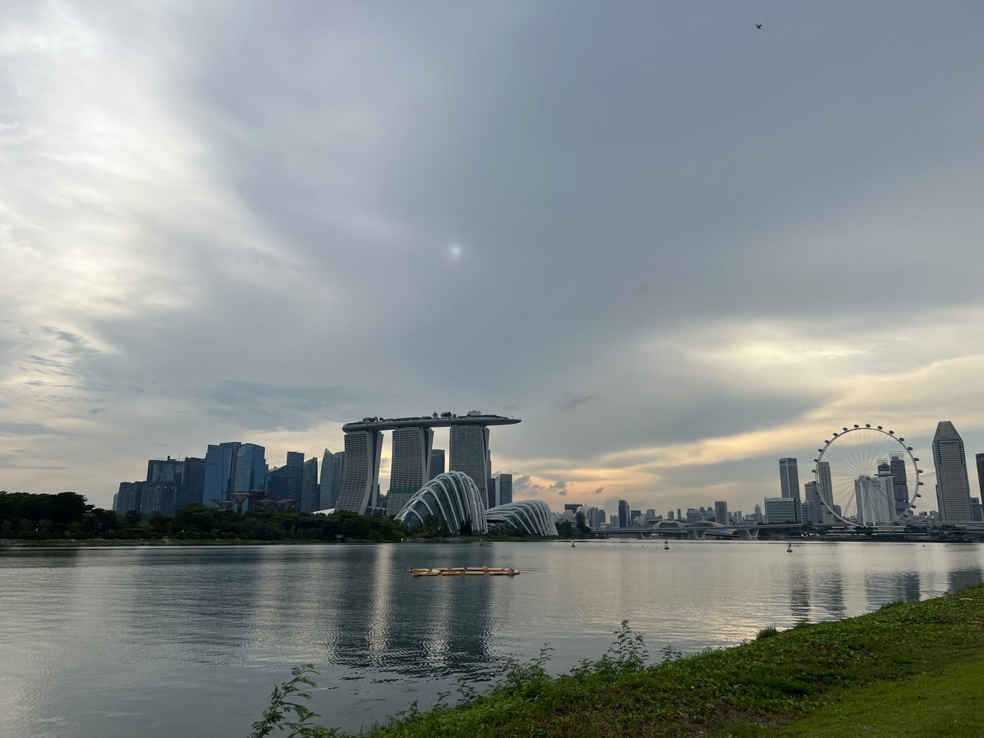
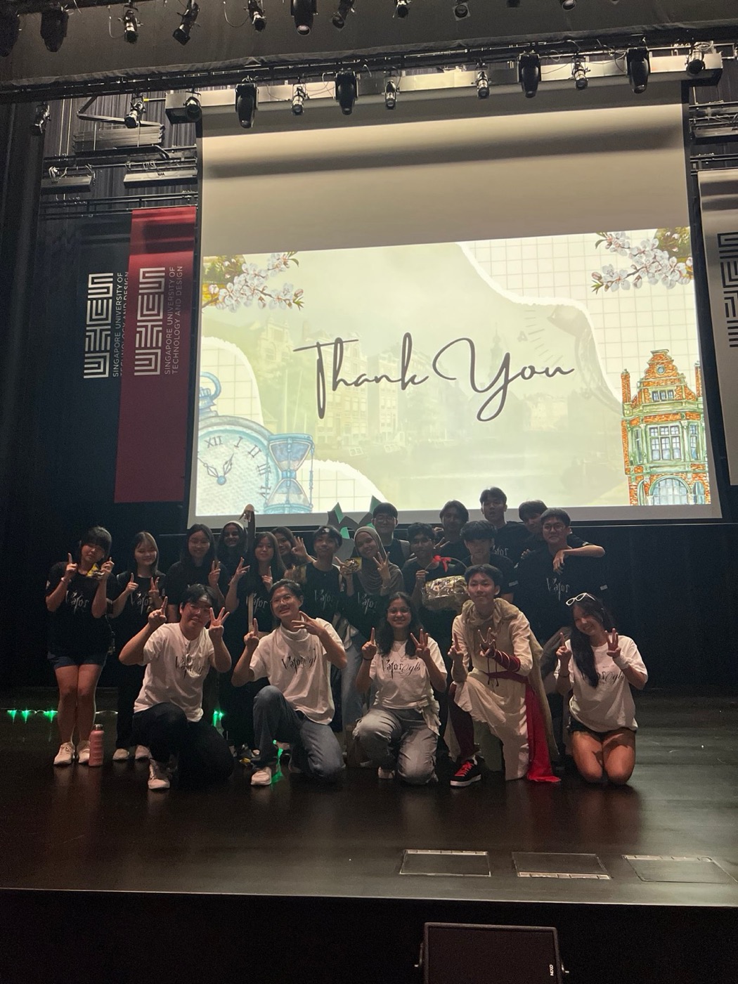
My first year at SUTD: class SC01, the people in Mythos, and the projects that taught me how I like to work.
09
Social media and posters for Fraternitas
Looking back
Designing for a faith community taught me that social media is about invitation, not reach. A Chill Out with the Friars poster is not an event listing. For many young people, it is the first thing they see before deciding whether to walk through a door they have never walked through before. That made tone as important as layout. Every design had to be warm, honest and welcoming, never pushy and never loud for the sake of it.
That responsibility changed how I design. In a feed full of noise, the easy move is to chase attention with bold colours and dramatic headlines. For a vocation evening or a community gathering, attention is not enough. The goal is trust. My question became not "will people notice this?" but "will the right people feel invited?"
The friar profile slides were the strongest part of the series. Pairing each event poster with a friar's own story, from Friar Robin Toha, OFM to Friar Derrick Yap, OFM, put a face and a voice to something that can feel distant. A vocation is deeply personal, and telling it through real people made it approachable. Good design makes people feel known, not marketed to.
Running Fraternitas' Instagram and Telegram taught me the system behind good content. Posters are one piece. The rest is planning ahead of events, holding a consistent visual identity, writing captions that sound like a community instead of an organisation, and following through so interest turns into sign-ups. Seeing outreach and sign-ups grow was the payoff for that consistency.
My technical internship at the Digital Church Office shows me the other side: the systems, schedules and tools behind what people scroll past. Every post depends on workflows, approvals, websites and platforms that have to work reliably. Designing the "We're Hiring Interns" poster, calling for young adults with Canva, WordPress and social media skills, was fitting, because those are exactly the skills I have been building in myself.
This work proved that consistency matters as much as creativity, and that a small team with a clear voice reaches far more people than its size suggests. It also showed me how powerful design is when it serves something bigger than itself.
I bring that to every community I join, and exchange will add new ones. Whether I am promoting an IEEE event, a Mythos gathering or a GEXP sharing session, I design the way I learned here: with warmth, with honesty, and with the person on the other side of the screen always in mind.
Back to the list ↑